The new jerseys won't be complete until the accompanying scoreboard reads Sens 7 Leafs 0.
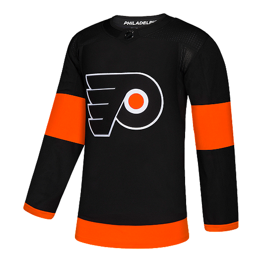
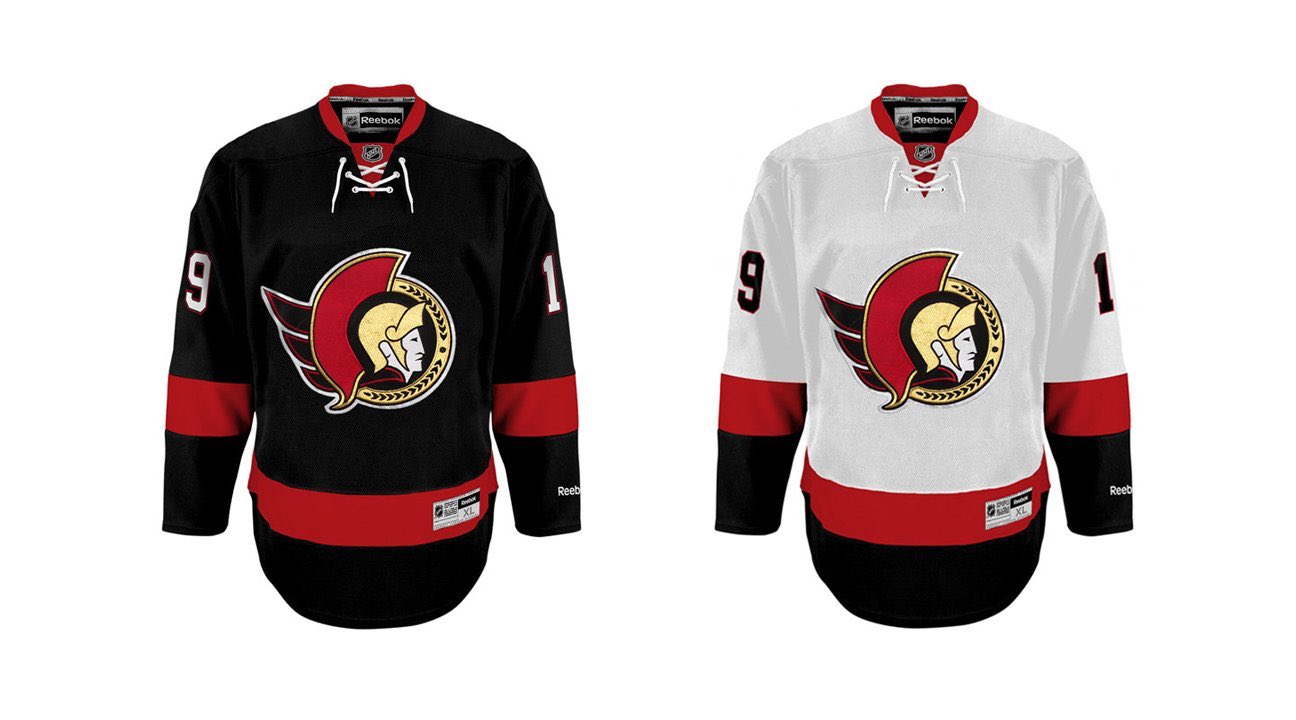
In seriousness, I like the gold trim over the wings. I still think they should go for a solid red arm bar as opposed to two red stripes on the sleeves.
They aren’t the same. One is Reebok one is adidas. The Sens ones have laces, and the bottom striping is not the same. They look a lot classier. The flyers looks like a third jersey.
look at the black Sens jersey. To match the flyers jersey you would have to take away the bottom black stripe.
Okay fair enough. My original point was that I liked the solid red arm bar better than two thinner red stripes on the sleeves. That was the only point I was trying to make.
Okay fair enough. My original point was that I liked the solid red arm bar better than two thinner red stripes on the sleeves. That was the only point I was trying to make.
They aren’t the same. One is Reebok one is adidas. The Sens ones have laces, and the bottom striping is not the same. They look a lot classier. The flyers looks like a third jersey.
look at the black Sens jersey. To match the flyers jersey you would have to take away the bottom black stripe.
I am so pumped for these New Jerseys. This logo bring me back a lot of painful memories (powerhouse with 1st round exit) but also bring a lot of GOOD memories( Stanley cup run + powerhouse years) can’t wait for them to be out!!!!!!!!! Oh and that jersey remind me of the good old days with the PIZZA line!!!!
Which would mean they likely have some produced or would have without covid, if so I was hoping we would have seen a true leak instead of a description from an artists rendition....I believe that's what the athletic references right? A design and not an actual physical Jersey right?
This site uses cookies to help personalise content, tailor your experience and to keep you logged in if you register.
By continuing to use this site, you are consenting to our use of cookies.