News Article: Preds 2020 WINTER CLASSIC

Status
Not open for further replies.

hockey diva

RIP Pred303
Sponsor
May 17, 2010
5,078
2,611
Beleriand
It’s not horrible but...

Why is it so bloody hard to design a decent logo for the NHL?! :ha::banghead:

The new Canes jerseys are horrid and boring.
 

PredsV82

Rest easy, 303, and thank you.
Sponsor
Aug 13, 2007
35,427
15,647
Schroedingers box
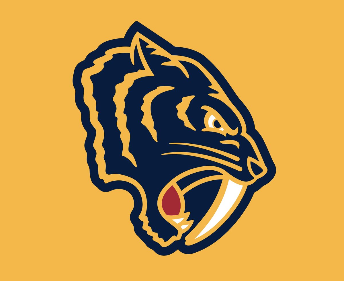
It's polarizing. I see people who love it and people who hate it. Not much middle ground though. Just going to have to let it marinate and see how the rest of the sweater looks. Wonder if they're going Dixie Flyers style on the front since this is on the shoulder?

EFpj_QRW4AALuC9.jpg

The lines on our logos have always been sharp. This one looks "furry" and therefore like too many generic college football Wildcat/Tiger logos
 

LCPreds

Registered User
Dec 8, 2013
7,522
4,337
TN
It's so funny how opinions can vary so wildly on something like this. I want a white jersey with some variation of that logo. It doesn't look at all like the Panthers to me. Frankly I want it to be pretty different from our usual style.
 

sparkle twin

Registered User
Jul 31, 2002
9,131
3,330
Smashville, TN
It's ok. For a shoulder patch.


The picture in this thread and everything the Preds put out over social media has the logo facing the way our regular pred head faces.

All the t-shirts the players were wearing and all the merchandise with the logo have the logo facing the other way.

Which is it?


AdmiralsFan24

Registered User
Mar 22, 2011
14,979
3,896
Wisconsin
Why do teams insist on putting a fire emoji for a tweet on uniforms? These are not "lit" and even if they are, let the fans decide how lit they are. Doing it on your own is pathetic and can backfire if the logo is total garbage. This one isn't that but it's not good either.
 
  • Like
Reactions: cjerina

BigFatCat999

First Fubu and now Pred303. !@#$! you cancer
Apr 23, 2007
18,884
3,047
Campbell, NY
You need two different facing heads because of two shoulders and $ says Dixie flyers inspired. Also better than ads
 

sparkle twin

Registered User
Jul 31, 2002
9,131
3,330
Smashville, TN
You need two different facing heads because of two shoulders and $ says Dixie flyers inspired. Also better than ads
Oh, duh, lol. Yeah, that makes sense. I was thinking just one shoulder and something else on the other. I didn't even think about it being on both. Blame it on the heat yesterday! :dunce:
 

Kebs

Def not just a zombie tiger typing
Aug 21, 2009
279
105
Nashville, TN


For those saying it looks like a High School/College Football logo you are right. If you skip towards the end of the video Sean Henry repeats that several times talking about the logo. Also keep in mind that we are the road team and the jersey is probably going to white.

I personally love it. I can't wait to score a hat with the logo on it. Looks for the primary crest to be a word mark btw.
 
  • Like
Reactions: AtlantaWhaler

Stephen

Moderator
Feb 28, 2002
78,705
53,222
That retro college look gives the Preds head a like Original 6 ish vibe. Really nice.
 

NoNecksCurse

#164303
Oct 19, 2011
13,236
4,958
jerseys should be released sometime around the second week of November if it follows the date of last years jersey release and winter classic. I wish it was sooner.
 
  • Like
Reactions: FilthyScoresberg

OriginalName

Registered User
Aug 22, 2016
114
111
Imabari, Japan
I know that it's a real nitpick, but I don't think they made a good design choice with how they filled in the space between the fangs and the open mouth. It muddies up the design by making you have to look at it for an extra second to separate the foreground and the background, which is work that a cleanly-designed logo should do for you. As it is, upon first view it's a big navy blue blob that tasks the viewer with figuring out which part of that blob is and isn't the tiger -- not that doing that takes the eye more than a second to figure out, but it keeps the design from having that instant recognition factor that an ideal logo's meant to provide.

Every Predators logo up until now has left that space subtracted to differentiate between foreground and background and emphasize the fangs -- the original, the current, the mustard, the skull patch... all of them. The fangs are the distinctive visual element of our mascot -- the negative space is what makes them pop out at you, and every design up until now has utilized that.

I did this real quick and dirty in about a minute with Microsoft Paint, but hopefully this'll illustrate my point.

cut.jpg
 
Last edited:

Roman Yoshi

#164303
Aug 16, 2009
10,792
3,030
Franklin, TN
I know that it's a real nitpick, but I don't think they made a good design choice with how they filled in the space between the fangs and the open mouth. It muddies up the design by making you have to look at it for an extra second to separate the foreground and the background, which is work that a cleanly-designed logo should do for you. As it is, upon first view it's a big navy blue blob that tasks the viewer with figuring out which part of that blob is and isn't the tiger -- not that doing that takes the eye more than a second to figure out, but it keeps the design from having that instant recognition factor that an ideal logo's meant to provide.

Every Predators logo up until now has left that space subtracted to differentiate between foreground and background and emphasize the fangs -- the original, the current, the mustard, the skull patch... all of them. The fangs are the distinctive visual element of our mascot -- the negative space is what makes them pop out at you, and every design up until now has utilized that.

I did this real quick and dirty in about a minute with Microsoft Paint, but hopefully this'll illustrate my point.

View attachment 263259

While i still don't love it, that change alone makes it significantly better.
 
Status
Not open for further replies.

Ad

Upcoming events

Ad

Ad