Oilers Darkening blue to navy for jerseys next year

Del Preston

Registered User
Mar 8, 2013
63,171
78,954
Please be true.

Those orange jerseys are hideous.
I liked them at first but that striping doesn't work well on an orange jersey, and the navy is too dark. The numbers on the roads are also kind of a mess without a white outline in between.
 

ujju2

Registered User
Apr 9, 2016
9,631
6,468
Edmonton, AB
I did a quick colour replacement in Photoshop.

K6yN3H2.jpg
BIAmgSu.jpg

Looking back on this, I realize it's not the navy that I hate, it's the new brighter orange. That photoshopped jersey is sharp - as is the original one.
 

Mcnotloilersfan

I'm here, I'm bored
Jul 11, 2010
11,071
5,112
Niagara
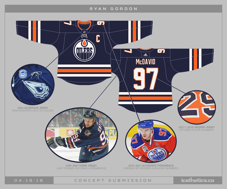
Please go back to Blue. I'll always cheer for my Oilers, and I thought the Orange was an okay 3rd jersey... but this season has an orange stain all over it. Personally I would love to go back to the Navy jerseys. That is what I grew up with and loved. They were solid in the last cup run. But honestly, any Blue will do.
 

Jamin

Registered User
Aug 25, 2009
4,924
778
I'm still convinced the Hunter orange is half to blame for the home PK trouble.
Years and years ago there was an article on fleury. They asked him why he got rid of his yellow pads. He said a season ticket holder was an eye doctor and told him yellow is one of the colors the human eye can see fastest.

I couldn't help but think of this when wondering why such a discrepancy between home and away. Maybe full speed you have a millisecond to react those neon orange jerseys make it easier on the opposition?
 

Ad

Upcoming events

Ad

Ad