

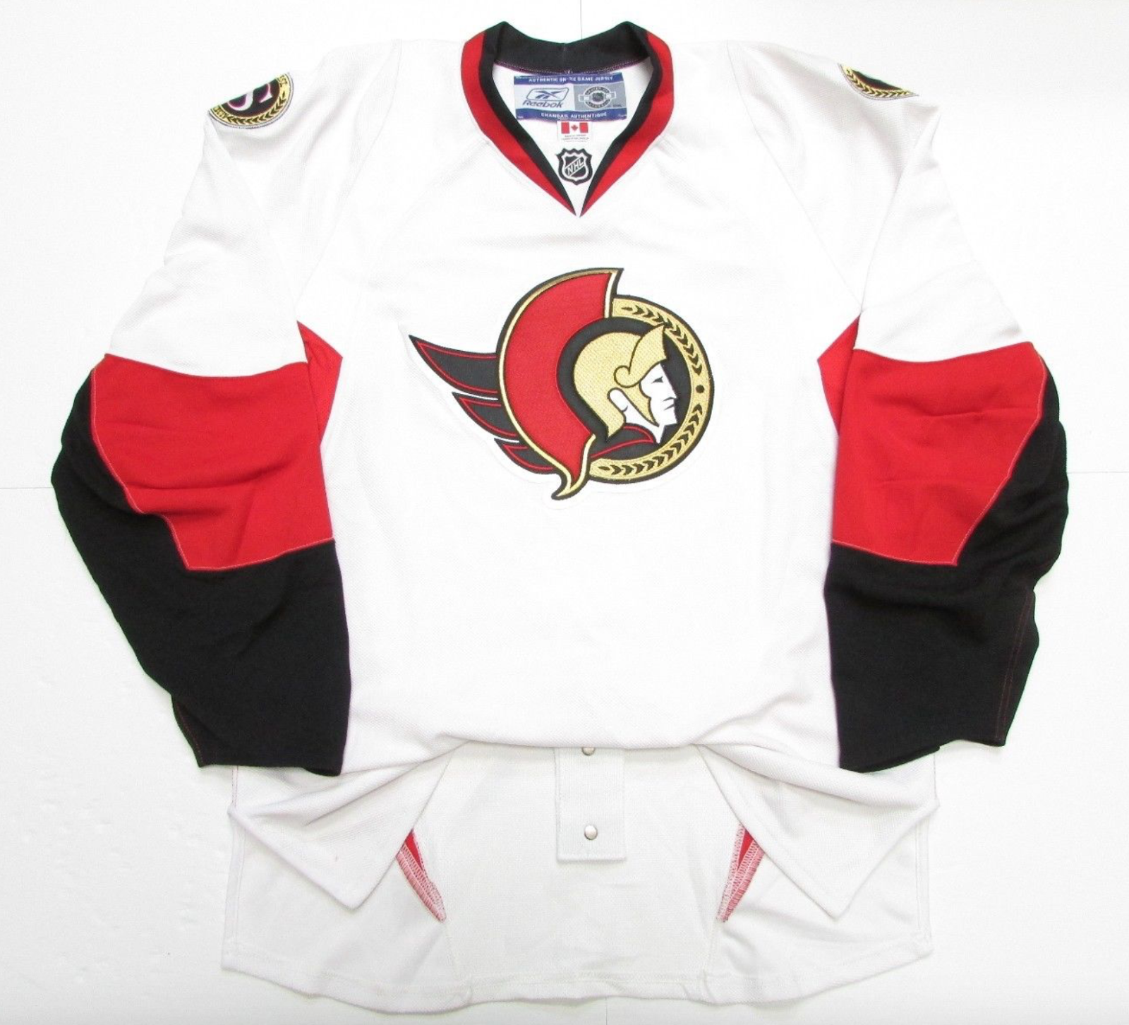
Hopefully Sens sweaters are as nice as this CHL team's or the current AHL affiliate's some day!
OT: Official Jersey and Merch Thread II
- Thread starter Quo
- Start date
You are using an out of date browser. It may not display this or other websites correctly.
You should upgrade or use an alternative browser.
You should upgrade or use an alternative browser.
- Status
- Not open for further replies.

Que
What?
Hopefully Sens sweaters are as nice as this CHL team's or the current AHL affiliate's some day!
It has to be ownership toying with us. Why would they deprive their fan base of such awesome and likely demanded apparel?
We own the rights to the logo and we used it before so we don’t need approval from the league to switch to them.
It’s a logo that could be etched on a pillar in Ancient Rome or on a holo-t-shirt 2000 years in the future and still look relevant.
It looks even neater with gold laurels in the waist and wrists, but either way, such an awesome design.
I love both the 2-D and O and find it hard to pick between either, conversely I absolutely loath the current 3-D thing for too many reasons to list.
I am not sure about sales figures but I assume it is one of few things: the 3-D current logo is loved and sells well (Highly unlikely imo), Eugene is all about the 3-D and loves them (Rumour but seemingly likely), Spite to the fanbase (seemingly extremely unlikely), no funding or desire to fund branding and logo change.
PeterSidorkiewicz
HFWF Tourney Undisputed Champion
God damn, so much better than the atrocities we wear now (red and white 3d logo).
edguy
Registered User
I officially own one of these and can confirm that is exactly how I bought it haha.
Tonights whole tribute to the team is so cool
edguy
Registered User
Anyone else interested in owning one of the PEI Senators Jerseys, here is the link to the Demitra one. But there are 5 or 6 on the same FB page all up for auction
Back in Black
All Sports would be great if they were Hockey
Engineer
Rustled your jimmies
- Dec 23, 2013
- 6,143
- 1,892
Absolutely not.Soooo, who's buying one??? (I'll probably get one on sale)
InTkachukWeTrust
Registered User
- Nov 10, 2013
- 1,810
- 736
Maybe if he re-signs for 18 years.Soooo, who's buying one??? (I'll probably get one on sale)
View attachment 179617
View attachment 179615
My Dad is an avid collector of game-worn jerseys and has given me dozens of jerseys, one of which being an old PEI Sens jersey.
InTkachukWeTrust
Registered User
- Nov 10, 2013
- 1,810
- 736
CAN SOMEONE TELL ME WHY THESE ARENT OUR JERSEYS LIKE COME ON WHY DO WE ALWAYS DO THE OPPOSITE OF WHATS RIGHT
Matthew Weeks
Registered User
- Jan 29, 2019
- 1
- 0
QUESTION:
I have Premier New York Ranger Reebok Jersey in size Large.
Which size should I get in the Authentic 2.0 Jersey?
I have Premier New York Ranger Reebok Jersey in size Large.
Which size should I get in the Authentic 2.0 Jersey?
BonkTastic
ಠ_ಠ
QUESTION:
I have Premier New York Ranger Reebok Jersey in size Large.
Which size should I get in the Authentic 2.0 Jersey?
52 most likely.
54 if you like wearing your jerseys "baggy'.
danielpalfredsson
youtube dot com /watch?v=CdqMZ_s7Y6k
- Aug 14, 2013
- 16,575
- 9,269
QUESTION:
I have Premier New York Ranger Reebok Jersey in size Large.
Which size should I get in the Authentic 2.0 Jersey?
How tall are you?
If you're average height, 52 is probably the safest option. If you aren't freakishly tall and have the ability to try it on first, I would try a 50 if you like form fitting clothing, but if you're ordering online that's a big risk.
54 will be very baggy, so if you want that sort of fit, go for that.
I'm assuming you're talking about Reebok Edge 2.0's. and not Adidas Authentic jerseys.
Last edited:
Back in Black
All Sports would be great if they were Hockey
It's not the size, it's the right team you must get...I have Premier New York Ranger Reebok Jersey in size Large. Which size should I get in the Authentic 2.0 Jersey?
Back in Black
All Sports would be great if they were Hockey
Link?
Anyone else interested in owning one of the PEI Senators Jerseys, here is the link to the Demitra one. But there are 5 or 6 on the same FB page all up for auction
Tnuoc Alucard
🇨🇦🔑🧲✈️🎲🥅🎱🍟🥨🌗
- Sep 23, 2015
- 8,056
- 1,914

GrantLemons
Church of FYOUS
Colour scheme is gorgeous, but I hate that logo. I never understood some people's obsession with it. Just a way worse version of the classic 2D imo.
danielpalfredsson
youtube dot com /watch?v=CdqMZ_s7Y6k
- Aug 14, 2013
- 16,575
- 9,269
Colour scheme is gorgeous, but I hate that logo. I never understood some people's obsession with it. Just a way worse version of the classic 2D imo.
I think one issue with the original 2D logo is that it is huge and sprawling. I think that's what the updated version tried to fix.
Another issue is that it might not translate well to various forms of embroidery and being used in small sizes of digital media. The Panthers cited this as an issue with their old leaping Panther, which is why they updated it for their new rebrand. (Not referring to the logo on the front of their home/away, but an actual updated leaping Panther logo they created).
Here's a prototype that leaked a few years ago showing how the Senators tried to make the original logo smaller.
I find a lot of people don't like the updated version on that concept that was posted. I don't get why people don't like it. To me, it's the best logo we could possibly go with right now. Each to their own I suppose.
DylanSensFan
BEESHIP: NBH
God damn, so much better than the atrocities we wear now (red and white 3d logo).
Yeah, the only "3-d" logo I have is the old black jersey with red, white and gold trim. Where legend has it, the face was modeled after Alexandre Daigle.
DylanSensFan
BEESHIP: NBH
I think one issue with the original 2D logo is that it is huge and sprawling. I think that's what the updated version tried to fix.
Another issue is that it might not translate well to various forms of embroidery and being used in small sizes of digital media. The Panthers cited this as an issue with their old leaping Panther, which is why they updated it for their new rebrand. (Not referring to the logo on the front of their home/away, but an actual updated leaping Panther logo they created).
Here's a prototype that leaked a few years ago showing how the Senators tried to make the original logo smaller.
I find a lot of people don't like the updated version on that concept that was posted. I don't get why people don't like it. To me, it's the best logo we could possibly go with right now. Each to their own I suppose.
This needs red and black trim at the bottom of the jersey as far as I am concerned
DylanSensFan
BEESHIP: NBH
tsn posted this crazy ugly concept things... (click on the right to go to the sens)
https://www.bardown.com/amateur-des...QIL4yAmW4XnzeWcfFxO5gEP3sG8qN0vyUi_hESeAZZz_o
I think if you're gonna have that white shoulder sash, then the shoulder patches need to be blue and moved up onto the sash, with numbers just below.
PeterSidorkiewicz
HFWF Tourney Undisputed Champion
Yeah, the only "3-d" logo I have is the old black jersey with red, white and gold trim. Where legend has it, the face was modeled after Alexandre Daigle.
I have an authentic Hossa in that jersey, good stuff.
DylanSensFan
BEESHIP: NBH
I have an authentic Hossa in that jersey, good stuff.
Mine doesn't have a number or name. I was thinking of putting Chabot on it, and then Tkatchuk on my black heritage jersey that I received as a Christmas gift from my wife.
- Status
- Not open for further replies.
Ad
Upcoming events
-
 Game 2 Vegas Golden Knights @ Dallas Stars - Vegas Golden Knights leads series 1-0Wagers: 12Staked: $10,874.00Event closes
- Updated:
-
Game 2 Los Angeles Kings @ Edmonton Oilers - Edmonton Oilers leads series 1-0Wagers: 19Staked: $45,615.00Event closes
- Updated:
-
-
-
