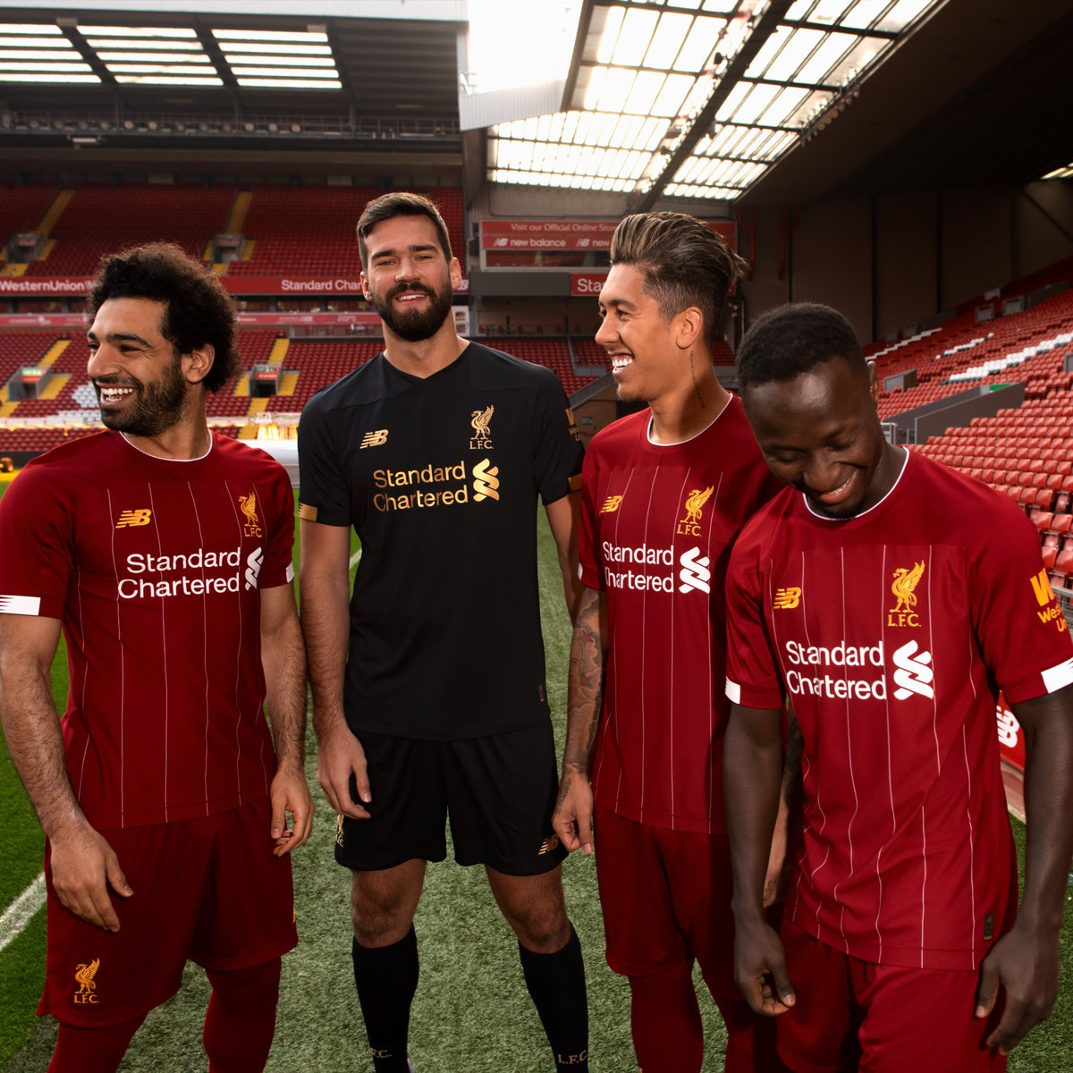
New Kits 2019-20

Burner Account

Registered User
Feb 14, 2008
37,418
1,744
Didn't see a thread for next season's kits.

D4atELbW4AEnBcz.jpg


I don't like how the stripes end below the shoulders but the GK shirt is sharp.
 

YNWA14

Onbreekbaar
Dec 29, 2010
34,543
2,560
Very strong kits as per usual from New Balance.

I thought the Black/Gold was the away kit and it gave me some nostalgia. One of my favourite kits.
 

Savant

HFBoards Sponsor
Sponsor
Oct 3, 2013
36,834
10,612
Liverpool kit looks so much better than the mock up. Not sure if getting one yet though. Stripe placement bothers me
 

koyvoo

Registered User
Nov 8, 2014
17,265
17,042
I agree that the Liverpool kit is very nice and would be even nicer if the stripes extended higher.

I also agree that the Juventus one is...bad. It’s just bad.
 

Live in the Now

Registered User
Dec 17, 2005
53,128
7,564
LA
The goalkeeper kit is spectacular. Might get one.

The Juventus kit is horrid, I can't believe they would allow that.
 

Havre

Registered User
Jul 24, 2011
8,459
1,733
I hate the current Juventus kit. That one is quite original if you ask me. Don´t think I mind it.

The shoulders ruins the Liverpool kit. Looks stupid. Could have been a fantastic top.
 

Machinehead

GoAwayTrouba
Jan 21, 2011
142,461
112,838
NYC
Yeah, clearly the "new-design-every-year" cycle is causing these kit designers to run out of ideas when trying to "spice up" iconic, simplistic kits.
I tend to agree. I like that they change things up in football, but I prefer two-year cycles at least.

If you wanna change every year, you can f*** around with away and third kits. Iconic home kits should be iconic.

Not that those checkers aren't lit (Croatia have great kits) but it's not Barca.
 

DrMartinVanNostrand

Kramerica Industries
Oct 6, 2017
4,588
5,077
Tampa, FL
aq0zis7-jpg-44581cd8d93253d1adad21a99dad380e-jpg.71814


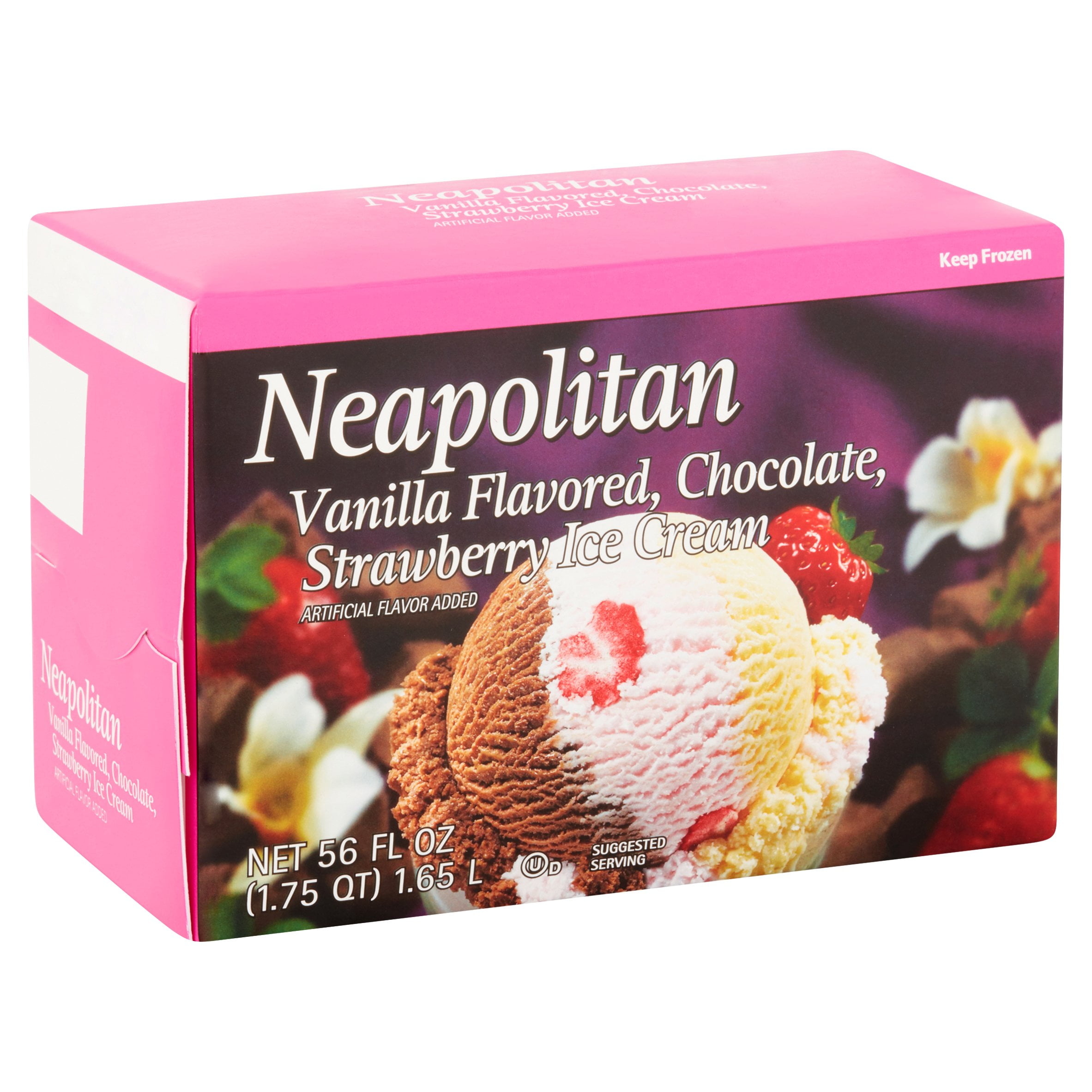
This is apparently the rumoured home kit. It's horrible. It looks like the Neapolitan ice cream.

I wouldn't mind that kit nearly so much if the back mirrored the front. The worst trend that's been going on for some time now with kits is that you'll have a pattern on the front of the kit and instead of seeing that pattern continue on the back, you get this blank template instead, destroying color balance as well in the process.

You see this happen with virtually any team that wears vertical stripes. And it sucks. If the back of that kit was black on the left and white on the right, that would be ok (Juve's worn red numbers before, if you're worried about the name and numbers coloring). It would be Juve's take on the classic Genoa/Caglari style kits. But this nonsense, and especially after the nonsense that is their kits this year?

I mean, as an Inter supporter, I'm all in favor of Juve's kits looking like crap, but they really can and should be doing much better.
 

Juve

Registered User
May 13, 2011
4,437
1,968
Somewhere around the world
I wouldn't mind that kit nearly so much if the back mirrored the front. The worst trend that's been going on for some time now with kits is that you'll have a pattern on the front of the kit and instead of seeing that pattern continue on the back, you get this blank template instead, destroying color balance as well in the process.

You see this happen with virtually any team that wears vertical stripes. And it sucks. If the back of that kit was black on the left and white on the right, that would be ok (Juve's worn red numbers before, if you're worried about the name and numbers coloring). It would be Juve's take on the classic Genoa/Caglari style kits. But this nonsense, and especially after the nonsense that is their kits this year?

I mean, as an Inter supporter, I'm all in favor of Juve's kits looking like crap, but they really can and should be doing much better.

Hahaha

The jerseys have been pretty bad ever since Addidas took over.

Here are some more leaks of next years kit.

d42jct5x4airv95-jpeg.72454


d42jd77wwaepb8i-jpeg.72455


4dbf81a8-d746-4d26-a611-f5e6d2b8358b_1.0255037ff541ca57b00adc69f2f729d3.jpeg


The back is even more horrifying than the front.
 

Ad

Upcoming events

Ad

Ad