No, but not because of the color.
That is some nasty-ass trim and logo design. Now replace the black accents with brown, make the trim and yoke more reasonable, and use a quality bear logo (more stoic Montana Grizzlies-esque and less mid-90s era UCLA smiling bruin) and that jersey would at least appeal to me, even if everyone else would complain

Boston's 2010 Winter Classic jerseys are my favorite Bruins jersey and I'm probably alone in that thought.
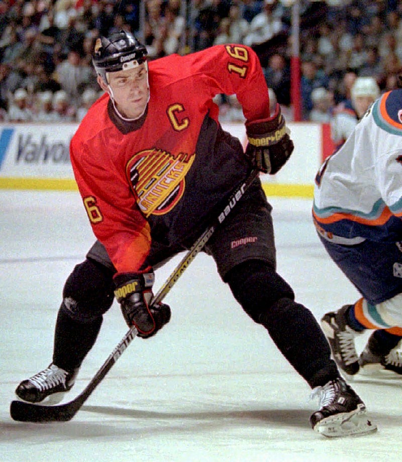
The less said about the alternates our teams debuted there, the better. Pretty much all-around for that 1995-96 class of alternates.
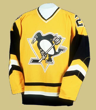
I never liked the robopenguin, but I despise every single element of that first alternate jersey. I'm jealous of the too shameful to wear beyond 1996 class...I can't handle the robopenguin being retro chic now.


 Yotes are hinting hard they’re dropping them for the original kachina design anyway so there won’t be any confusion.