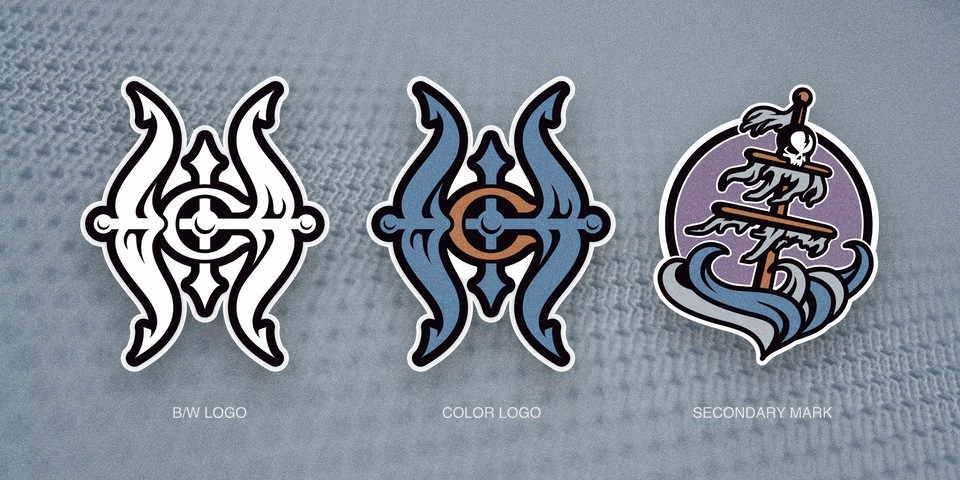
Logo/Colors/rebranding

Lempo

Recovering Future Considerations Truther
Sponsor
Feb 23, 2014
26,763
83,364
keep everything the same but change our name to the carolina cinnamon buns
You drop the name one time at the office in the vicinity of someone named Caroline, and your ass will be #metood so hard.

Or alternatively she'll drag you to the copy room for a quickie, but that's nasty sweaty business too and you wouldn't like it.
 

A Star is Burns

Formerly Azor Aho
Sponsor
Dec 6, 2011
12,319
39,105
If you think the Canes logo is better than the Mighty Ducks logo you’re high. The “Ducks” logos sure are trash though.

I'll take the Canes logo over the Mighty Ducks logo, even though I liked their logo. I liked their color scheme back in the Mighty Ducks days as well. But I actually loved the Canes logo from the second I saw it. It just works for me.
 

dukebluedynasty

Registered User
Mar 1, 2018
8
19
Thanks Aho. Obviously I know nothing about message board etiquette. In hindsight I probably should’ve toned that initial post down a bit. I signed up here bc I’m excited about the new ownership situation and the stability that comes with it. If they can break this perpetual cycle of mediocrity, frustration and disappointment I think that logo will look a little better to me.
 

Svechhammer

THIS is hockey?
Jun 8, 2017
23,642
86,817
Believe it or not, I remember someone telling me that when the franchise first moved here, they were thinking about using teal for their primary color but quickly nixed it as to not look like copying the Charlotte Hornets. This was when "Ice Hogs" was seriously considered as a possible name.
I don't know about that, but I do know the original proposal for the team was very different than what we got...

0714-car97-loh-logos.jpg


The uniform itself had a not so subtle nod to the Whalers as well...

hurricaneUnis.gif
 
Last edited:

tarheelhockey

Offside Review Specialist
Feb 12, 2010
85,079
137,743
Bojangles Parking Lot
The current logo is a bit like our original jerseys. Back when we had those, they were consistently rated among the worst in the league for being too busy and having too many modern elements. One touch-up later, we trashed them in favor of a more mainstream look. Overnight, the originals became a classic and the New Storm was trashed as a cheap O-6 knockoff look.

Same thing would likely happen with the logo. It’s underrated from a design perspective because people associate it with a bad team. It’s actually a really solid crest for a hockey jersey — geometric, symmetrical, balanced, looks good from a distance and has some aesthetic detail when viewed close up. It’s a literal representation of a hurricane but also has an abstract quality. I wouldn’t expect to see a better logo as a replacement — I’d expect to see something generic and knockoff-ish, which would be panned universally while the former logo elevates to nostalgia level 10.

We’ve had our crest for 20 years. For perspective, that’s longer than Anaheim had the duck mask; longer than Dallas had the Minnesota-style star; longer than the Kings wore purple and gold; about as long as the Caps wore their classic reds; and longer than the whale-tail logo existed. At this point we are at the exact phase of time when something becomes old but not yet immutable; if we just hang in there for about 5 more years, the cycle will turn again, late-90s style logos will come back in fashion, and we’ll be one of the groups that looks down our nose at hipster designers trying to copy our brand. Just let it sit for a while longer.
 

Boom Boom Apathy

I am the Professor. Deal with it!
Sep 6, 2006
48,305
97,632
As for the colors, I realize they agreed on the red bc of NCSU but that’s an easy fix now. If state’s playing use their colors on the scoreboard, ribbons and lighting. Then use a neutral color for the seats, etc.. So many NHL teams have the red/black scheme. Why not green and blue? It’s looks great on the ice and gives a nod to the club’s history.

And now we get down to the crux of it. dukebluedynasty doesn't want NC State colors.
 

Lempo

Recovering Future Considerations Truther
Sponsor
Feb 23, 2014
26,763
83,364
this thread can still be salvaged if we make it about legos, lego colors, and branded legos

i always liked the pirate ones back in the day

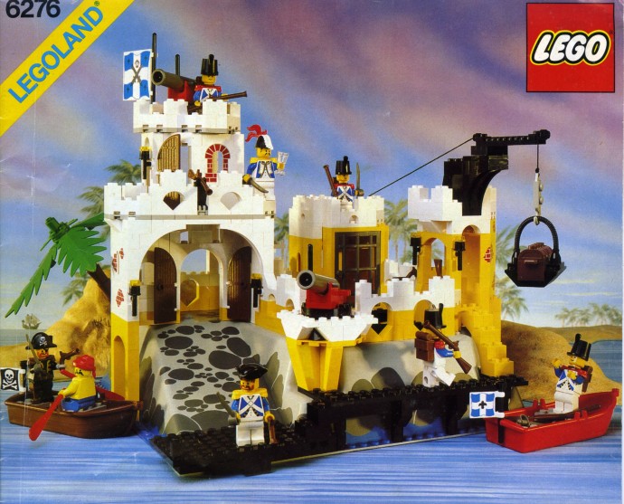
1+ to pirate legos. The absolute top thing I ever got for Christmas was the Governor's Fortress.

6276-1.jpg


Little did I know then, but that's actually Darling and Faulk on the boat coming to burn down the fort of the suspiciously Quebecois-looking folks.
 

Svechhammer

THIS is hockey?
Jun 8, 2017
23,642
86,817
Agreed with THH, the current logo set is good. As much as I have seen people crap on the Canes for having a bad logo, I have yet to see one attempt that improves upon the design. And believe me, its not for lack of trying - Concepts

The only thing I'll say about the look is that I was originally a little disappointed in the reveal because young me was expecting something that kind of looked like the Frankfurt Galaxy of NFL Europe.

NFLE-Lead.jpg
 

AeroFishOne

The Curriest of the Curry’s
Feb 5, 2010
1,323
4,696
Add me to the list that likes the secondary logo. I think it would be a cool change of pace to have the main colors gray and black with the red being a nice accent color like our old third. I’ve always liked the “pirate ship in a hurricane” imagery from some of Cams mask and the proto logo above. If done properly, I think it could be a cool new secondary logo, problem is I just don’t see how it’s possible. Maybe recolor that proto secondary red, shades of gray and black. I just miss having the shoulder patches of some sort.

Still absolutely hate how they dismantled our original jerseys and went with the “tradional look.” Lost the shoulder patches and the flag hem strips all at the same time.
 

Ad

Upcoming events

Ad

Ad

-->