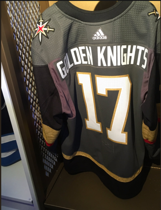
Jersey Unveil at Wynn on June 20th
- Thread starter KenSinBin
- Start date
You are using an out of date browser. It may not display this or other websites correctly.
You should upgrade or use an alternative browser.
You should upgrade or use an alternative browser.
Regarding the gloves:
I call bull. How did they get some gold but not full gold.
Vegas Mac
Golden Shellback
- Jun 26, 2015
- 563
- 195
Gold letters & numbers (not white) on the charcoal jerseys and removing the red stripe on the arm and these would have been among the best sweaters in the league in year one.
As it is they look clownish, cobbled together. Gold on the arm looks forced, since it's not tied in with the numbers/letters at the least.
Gonna look at them in person when I get back to town, but at this point I think the organization missed the mark.
As it is they look clownish, cobbled together. Gold on the arm looks forced, since it's not tied in with the numbers/letters at the least.
Gonna look at them in person when I get back to town, but at this point I think the organization missed the mark.
Vegas Mac
Golden Shellback
- Jun 26, 2015
- 563
- 195
I call bull. How did they get some gold but not full gold.
You simply sew the gold over the other material. Strength is there, and it looks right. There's been metallics on jerseys for years and it works fine provided it's sewn on top.
Ginormousthumbs
Registered User
Okay so obviously I really like the front and I'm not against the red stripe.

I don't know what in the hell those back panels are though and why they are a different color.
Color count up to 5 with the armpit shading. Why are the armpits a different color? Lol
VanIslander
A 19-year ATDer on HfBoards
Why the golden THICK BAR on the sleeve and socks?
The thin gold stripes and even red look good. But that thick golden band is fugly.
The thin gold stripes and even red look good. But that thick golden band is fugly.

BattleBorn
50% to winning as many division titles as Toronto
Color count up to 5 with the armpit shading. Why are the armpits a different color? Lol
I think it's just a different material reflecting weirdly with the flash.
mattihp
Registered User
The away jerseys look kinda nice. The home jerseys look a bit too much like old Senators discards... Hopefully the red stripe goes very soon.
Vegas Mac
Golden Shellback
- Jun 26, 2015
- 563
- 195
What kills me is they have the best primary and secondary logos in the league. Seriously, they're that good. But the stars on the shoulders are all the red you need, not sure why someone felt the need to push red into the primary pallette. That's a real fail for the Adidas crew, just about everyone I know don't like the red and the tweets are unanimous as well.
Seems to me that the team being the Golden Knights they should have ensured gold was dominant in the numbers, letters, etc. Just a couple tweaks and these things would be outstanding and the type of jersey casual fans & visitors to Vegas would buy just for the look.
Seems to me that the team being the Golden Knights they should have ensured gold was dominant in the numbers, letters, etc. Just a couple tweaks and these things would be outstanding and the type of jersey casual fans & visitors to Vegas would buy just for the look.
Vegas Mac
Golden Shellback
- Jun 26, 2015
- 563
- 195
Okay so obviously I really like the front and I'm not against the red stripe.

I don't know what in the hell those back panels are though and why they are a different color.
Those stars on the shoulder though... They got that right didn't they. Man those look great.
Ginormousthumbs
Registered User
The Kings missed a golden opportunity to switch back to their classic crown logo for the unpcoming season. That could have been a marketing/rivalry dream come true. Their current logo is so boring.
What kills me is they have the best primary and secondary logos in the league. Seriously, they're that good. But the stars on the shoulders are all the red you need, not sure why someone felt the need to push red into the primary pallette. That's a real fail for the Adidas crew, just about everyone I know don't like the red and the tweets are unanimous as well.
Seems to me that the team being the Golden Knights they should have ensured gold was dominant in the numbers, letters, etc. Just a couple tweaks and these things would be outstanding and the type of jersey casual fans & visitors to Vegas would buy just for the look.
I really don't get the aversion to the red stripe. I think it gives the jersey pop.
Ginormousthumbs
Registered User
The red stripe isn't necessary. It feels forced. Especially because of the red in the secondary logo.
Take the red out and the black portions out and replace it with more gray and you've got a damn good jersey. The fact that there aren't any gray home jerseys in the league is even more reason.
Take the red out and the black portions out and replace it with more gray and you've got a damn good jersey. The fact that there aren't any gray home jerseys in the league is even more reason.
broinwhyteridge
Registered User
mattihp
Registered User
The red stripe isn't necessary. It feels forced. Especially because of the red in the secondary logo.
Take the red out and the black portions out and replace it with more gray and you've got a damn good jersey. The fact that there aren't any gray home jerseys in the league is even more reason.
+1.
I would definately buy a jersey with that design if they get a decent finnish players. Haven't bought an NHL jersey in 15 years.
ronthemailman
Registered User
Maybe it's all the over lighting but the pants and socks look like windbreaker material, kinda silky and shiny...much prefer traditional cotton material look...seems like the polyester baseball uniforms from the 80's
EventHorizon
Bring Back Ties!
After how much I loved the logo, I had a feeling the jerseys would disappoint me. Was I wrong. These are beautiful. Those little details in the black on the logo and the gold stripes are wonderful touches. They really knocked it out of the park with this one.
Vegas Mac
Golden Shellback
- Jun 26, 2015
- 563
- 195
I really don't get the aversion to the red stripe. I think it gives the jersey pop.
I will admit that seeing them in person might change my mind. We'll see, but for right now meh.
That said I will of course buy one. But if I don't like them when I look at them in person I won't be buying originals for family and whatnot. Will go with shirts and other apparel.
Matias Maccete
Chopping up defenses
- Sep 21, 2014
- 9,688
- 3,604
I really don't get the aversion to the red stripe. I think it gives the jersey pop.
Agreed. My only complaint is I wish they made the black at the top of the jersey extend to the shoulder and neck of the jersey. More gold would've been cool with me too but I like non traditional and busy jerseys. The Coyotes old green thirds are just all time favorites, so my taste in jerseys is quite different haha.
CupInSIX
My cap runneth over
I really don't get the aversion to the red stripe. I think it gives the jersey pop.
Someone watched too many episodes of Trading Spaces with the mrs

+1.
I would definately buy a jersey with that design if they get a decent finnish players. Haven't bought an NHL jersey in 15 years.
Early indications are that Vegas will be selecting Eric Haula from Minnesota. Not sure if you count him as a decent Finnish player or not.
Refuse
Sin City Soldiers
- Aug 23, 2005
- 2,421
- 1,070
I think it's just a different material reflecting weirdly with the flash.
Probably. Could be the same material they use in the new socks.
Ad
Upcoming events
-
 2024 SoFi NBA Play-In Tournament Sacramento Kings @ New Orleans PelicansWagers: 5Staked: $318.00Event closes
- Updated:
-
 Stanley Cup 2024 Stanley Cup Champion - ONLY BET ONE TEAMWagers: 12Staked: $16,404.00Event closes
- Updated:
-

-

-
 Series Winner Boston Bruins vs Toronto Maple LeafsWagers: 8Staked: $3,310.00Event closes
- Updated:
