- Jan 3, 2012
- 14,523
- 12,383
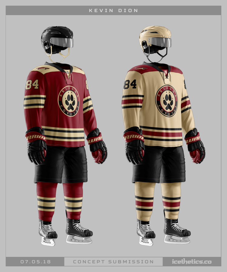
As far as colors, I would love to see a lot more of the tan and maybe some green as an accent color (since you can't have it touch the red) to go with the current sedona red and black. Also we need to slap the kachina style trim on the jerseys, pants, helmets, socks, mouthguards, Tyson Nash's ties, and anything else possible because it's so unique, so distinctly Arizona, and so good.
Kachina head logo on something like this with some kachina trim and crescent moon shoulder patches and I'm all in:
I like the logo.