
If the Coyotes design new unis would you prefer Kachina or Current logo as primary?
- Thread starter Coyotes2000
- Start date
You are using an out of date browser. It may not display this or other websites correctly.
You should upgrade or use an alternative browser.
You should upgrade or use an alternative browser.


Coyotes2000
Registered User
I personally attribute the howling Coyote to the Gretzky era.. I don't know why. The Kachina logo to me will always be the Coyotes identity but maybe that's me? I dunno. I love the color scheme of the black/cactus green/sand way more than the drab red/white/black everything all AZ teams seem to be going with. We have so much more diversity in our ecosystem then that!

Neighborhood Coyote
Registered User
- Sep 14, 2017
- 3,136
- 2,740
Hard question for me. In terms of jersey... the kachina jersey is the best, imo. It's unique and looks good to me... agree that the other jersey color scheme is kinda played out not only in AZ but across NA. Red, white, black....so many teams use those colors.
I'm all for doing something different and fun. Teams should embrace that it's in AZ as much as possible. The current design isn't bad at all, but it's certainly not trying to be different or be exclusively an AZ thing.
Now, to the logos... both are solid, imo. I'd be happy with either one going forward.
Neighborhood Coyote
Registered User
- Sep 14, 2017
- 3,136
- 2,740
Coyotes2000
Registered User
I think this fits under option 1, and I agree. That should be primary with the full coyotes as a 3rdJust the kachina head.
rt
The Kinder, Gentler Version
- Oct 26, 2006
- 18,544
- 11,365
I love the Kachina aesthetic. I think that the Mutts should either go with copper or something to do with the Arizona state flag if they're going to change their colors. Copper, black, and teal worked great for the Rattlers for a few years before they butchered their look - I think it'd look amazing on hockey sweaters.
The neo-Team Canada look that IceArizona gave us is better than the Gretzky-era rebrand, but not by much. Just makes us look all the more "rented" rather than "owned."
The neo-Team Canada look that IceArizona gave us is better than the Gretzky-era rebrand, but not by much. Just makes us look all the more "rented" rather than "owned."
StevenF1919
Registered User
The Kachina is the best logo in the NHL.
moosemeister
5,000 strong
I overheard something I probably wasn’t supposed to. Not sure how true it is, but we are scrapping the howling dog
OriginalJetsCoyotes
Registered User
OriginalJetsCoyotes
Registered User
CLW
Registered User
- Nov 11, 2018
- 6,833
- 6,431
I always was a big fan of the Kachina. I agree with just the had, as the full logo is a bit too 'busy' on a shirt.
I don't like the howling coyote, way too 'cute' to be worn casually. For example, The Vegas Knight helmet can be worn by anybody, the coyote head not so much. I don't want to wear a cap with the coyote head, but the Vegas logo would be np, partly because it's both very clear and visible but it's also doesn't jump at you like the coyote head. The coyote head is a logo designed for kids imo.
I don't like the howling coyote, way too 'cute' to be worn casually. For example, The Vegas Knight helmet can be worn by anybody, the coyote head not so much. I don't want to wear a cap with the coyote head, but the Vegas logo would be np, partly because it's both very clear and visible but it's also doesn't jump at you like the coyote head. The coyote head is a logo designed for kids imo.
rt
The Kinder, Gentler Version
Doesn’t work with the Houston look?I overheard something I probably wasn’t supposed to. Not sure how true it is, but we are scrapping the howling dog
moosemeister
5,000 strong
Doesn’t work with the Houston look?
I don’t think you need to worry about Houston yet
Bonsai Tree
Turning a new leaf
- Feb 2, 2014
- 9,234
- 4,558
yetI don’t think you need to worry about Houston yet
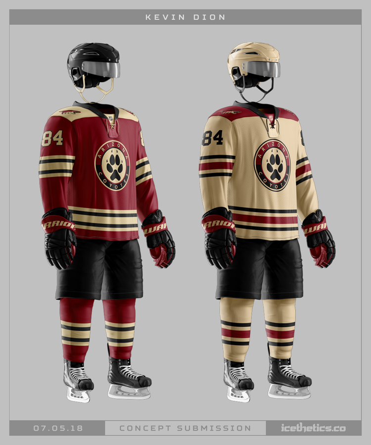
I vote for something like this (from google images)
- The dark kachina doesn't look good on TV, so swap out the black background for our red/maroon color
- Just dump the green all together to simplify the color scheme/pattern
- The logo colors are simplified too, using only a few colors instead of 5-6. Maybe tweak it a little so the logo isn't the same color as the background to make it pop better.
- As far as the below, I'd swap out the shoulder patches. Make one the moon logo (red not purple to match) and the other the current Coyote head logo.
- use a "Kachina" style font for the numbers
- small thing but just bump down the bottom band so everything's not all scrunched
Coyotes2000
Registered User
I vote for something like this (from google images)
- The dark kachina doesn't look good on TV, so swap out the black background for our red/maroon color
- Just dump the green all together to simplify the color scheme/pattern
- The logo colors are simplified too, using only a few colors instead of 5-6. Maybe tweak it a little so the logo isn't the same color as the background to make it pop better.
- As far as the below, I'd swap out the shoulder patches. Make one the moon logo (red not purple to match) and the other the current Coyote head logo.
- use a "Kachina" style font for the numbers
- small thing but just bump down the bottom band so everything's not all scrunched
Sold.
StevenF1919
Registered User
Needs more cactiI vote for something like this (from google images)
- The dark kachina doesn't look good on TV, so swap out the black background for our red/maroon color
- Just dump the green all together to simplify the color scheme/pattern
- The logo colors are simplified too, using only a few colors instead of 5-6. Maybe tweak it a little so the logo isn't the same color as the background to make it pop better.
- As far as the below, I'd swap out the shoulder patches. Make one the moon logo (red not purple to match) and the other the current Coyote head logo.
- use a "Kachina" style font for the numbers
- small thing but just bump down the bottom band so everything's not all scrunched
Imaravencawcaw
Registered User
- Jul 19, 2018
- 1,142
- 1,815
As far as colors, I would love to see a lot more of the tan and maybe some green as an accent color (since you can't have it touch the red) to go with the current sedona red and black. Also we need to slap the kachina style trim on the jerseys, pants, helmets, socks, mouthguards, Tyson Nash's ties, and anything else possible because it's so unique, so distinctly Arizona, and so good.
Kachina head logo on something like this with some kachina trim and crescent moon shoulder patches and I'm all in:
Kachina head logo on something like this with some kachina trim and crescent moon shoulder patches and I'm all in:
LuckyNumber11
Registered User
Coyotes2000
Registered User
This shouldn't be scoffed at to be honest. It's easily the most identifiable parts of our location. How in the hell is a Saguaro not in a logo of ours? All we've had was the green jersey from way backNeeds more cacti