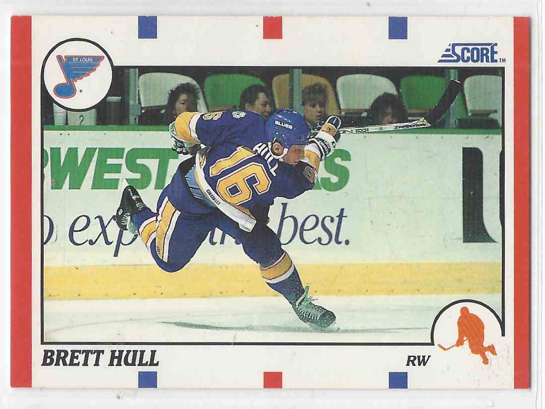
Agreed, such a nice and simple set with all the new stars of the early 90s (Jagr, Hasek, Fedorov, Mogilny, Bure, Roenick, Sundin, etc.).
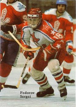
My favorite card from that set is probably the Fedorov card because its failure to show anything of what Fedorov was as a player. His speed, or his shot, or his back-checking. No, it's just a guy holding a puck with his left hand, looking at it curiously, while holding his stick with the other hand, with his legs in a peculiar knock-kneed position.
This card also plays on your imagination if you know the story about a puck disappearing in Fedorov's pants in an international game against Sweden (was it World Juniors perhaps?), a game which the Soviets won on a goal with two pucks in play. Looking at this card, you wonder if he's thinking "Should I try to put this one in my pants also? Perhaps no one will notice...."