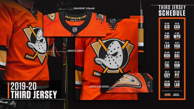
Confirmed with Link: Ducks unveil new 3rd jerseys

MMC

Global Moderator
May 11, 2014
48,226
39,222
Orange County, CA
EFfdvc5UUAAO7aQ
 
Last edited:

Dryish

Nonplussed
Dec 14, 2015
1,580
2,139
Hki Metro
I love the black, white, and gold palette, and always have. Thought the post Mighty Duck era jerseys were gorgeous too. Fight me.

I'll agree that the bands look weird, though. There's too many colours involved, makes it busier than it needs to be.
 
Last edited:

Goose of Reason

El Zilcho
May 1, 2013
9,649
9,264
Anaheim should just go with the third jersey from last year until the end of time. Literally the easiest decision in the world.

Tbh I liked those jerseys less and less as the season wore on. I saw a video of a guy unboxing a Selanne Mighty Ducks jersey today and now I just want those back. The eggplant is so nice, and no teams in the league have purple as a main colour.

I bet the design of our current jerseys would look great with the eggplant and teal replacing the black and orange, if they didnt want to go full throwback.

Our thirds last year are leagues better than this one though. I really hope we dont wear these.
 

wraparound

Registered User
May 17, 2014
704
365
Jeezy creezy, the adidas version of the orange Ducks 3rd looks worse than the Reebok one & I didn’t think that was possible. Imagine having the most iconic uniform/logo/color scheme at your disposal & you go with an MS Paint caliber design that pays zero mind to color theory. The clownery!
 

bsu

"I have no idea what I am doing" -Pat VerBleak
Sep 27, 2017
28,539
29,291
The intro date should say "never"
 

ZzZz

Registered User
Dec 22, 2017
433
248
Hopefully the gold on the shoulder patches doesn't deteriorate into green like it did with the crappy Reebok jerseys. About the best jersey that's gonna happen with this color palette. Could do away with the gold pin stripe at the bottom of the arm bands.
 

pesko

Registered User
Sep 14, 2004
962
85
This is what happens when you design by committee. Ducks are black and gold, but Samueli wants orange, whatever is designed has to check all of those boxes and the end result is a mess. I wish the ownership would realize they have one of the most recognizable, valuable and likable brands in hockey in the original branding, that they choose to ignore but is sitting right in front of them.
 
  • Like
Reactions: Mortal Wombat

Terry Yake

Registered User
Aug 5, 2013
26,804
15,277
god awful. really wish they'd go away from the orange

just keep the third from last season as the regular third. or better yet, do away with the terrible D logo and make the third the regular home sweater and make a white away version
 

Ad

Upcoming events

Ad

Ad