I liked our 25 year anniversary throwbacks (see avatar). The classic white jersey with our new blue pants looked surprisingly sharp. Nice mashup of old and new style.
Thanks, yeah I thought about giving a blue side to the bolt but wasnt sure stevie y and co would change the primary logo, so tried to make a concept as close to what I think they will do.
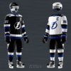
Blue in the logo would bleed into the black making it a muddy mess. The only way you could get away with it would be by adding white outlines (strokes) but imo that just looks unnecessary and a little too busy (like our previous logo). Personally I LOVE these, wish they were our primaries. I mean seriously am I crazy or would this not be the best we’ve ever looked. Imo it’s a no brainer.
Blue in the logo would bleed into the black making it a muddy mess. The only way you could get away with it would be by adding white outlines (strokes) but imo that just looks unnecessary and a little too busy (like our previous logo). Personally I LOVE these, wish they were our primaries. I mean seriously am I crazy or would this not be the best we’ve ever looked. Imo it’s a no brainer. View attachment 125697
This site uses cookies to help personalise content, tailor your experience and to keep you logged in if you register.
By continuing to use this site, you are consenting to our use of cookies.