SO many options.. and this is the best they could do? The colors are "ok" but they could insert something more original like the mint green color. The crown in the crest is clip-art-esque. The monogram seems to be liked, jokes aside, but the whole thing is very unimaginative. Especially the name. It just seems very disappointing.
There were a lot of logo/jersey mock-ups that had mint green as the primary color. Well before anything said "minted in 2020" or whatever. All look better than the final product IMO. Instead they are called Charlotte Football Club with the exact same colors as the Charlotte football team.
There were a lot of logo/jersey mock-ups that had mint green as the primary color. Well before anything said "minted in 2020" or whatever. All look better than the final product IMO. Instead they are called Charlotte Football Club with the exact same colors as the Charlotte football team.
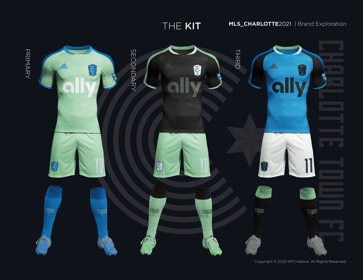
I actually really like the idea of mint green as a nod to the city's history. It's an eye-catching color that's almost entirely unused in sports and as far as I know, would be unique in North American pro sports. That would have been an absolutely brilliant move.
"Minted 2020" is just lame, especially as the only touch of personality in the entire name or logo selection.
There were a lot of logo/jersey mock-ups that had mint green as the primary color. Well before anything said "minted in 2020" or whatever. All look better than the final product IMO. Instead they are called Charlotte Football Club with the exact same colors as the Charlotte football team.
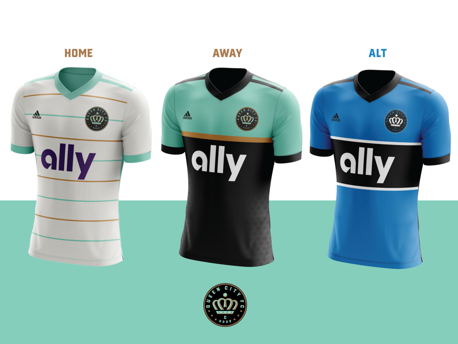
That third one looks fantastic. I think it's a great color scheme adding the mint to purple and yellow as a royalty nod to Queen City. I like the stripe homage in the first and fourth to QPR, but the third one looks great. A shame they went so vanilla in the name.
This site uses cookies to help personalise content, tailor your experience and to keep you logged in if you register.
By continuing to use this site, you are consenting to our use of cookies.