Canucks Reverse Retro Jersey (yes, it's a gradient jersey)

So what do we think of the Canucks’ reverse retro jersey?


  • Total voters
    124

LuckyDay

Registered User
Mar 25, 2011
1,781
1,171
The Uncanny Valley


g3efvb8zymz51.jpg


Next week the league brings out the teams 4th Sweaters, the so-called reverse retro jerseys
sedJp8J.png

Eme9uszVoAAFYRS.jpeg


Canucks uniforms are infamous for being (some of) the worst in all sports.

Could the Canucks actually get the inverse of this and get one that's actually good?
 
Last edited by a moderator:
  • Like
Reactions: Ringmaster

Zombotron

Supreme Overlord of Crap
Jan 3, 2010
18,330
9,862
Toronto
Interested in Colorado's Nords tribute, Arizona's Taco Bell purple uniforms and 90s Ottawa in red (which I think could end up being used as their primary uniform in the future)
 

Bojack Horvatman

IAMGROOT
Jun 15, 2016
4,062
7,149
In physics a gradient is the greatest increase in a number across space, and it is a vector. Objects have an upward buoyant force in fluids because there is a pressure gradient. Wind is also caused by a pressure gradient. Things fall to the earth because of a potential energy gradient. If you want to get technical, things fall because of a time gradient.
 

vadim sharifijanov

Registered User
Oct 10, 2007
28,739
16,129
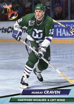
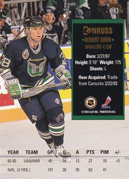
getting some early 90s whalers vibes here

like when

4920-71Fr.jpg


turned into

4938-1204393Bk.jpg


man, still wish we could have found a way to make the craven trade and keep kronner.
 
  • Like
Reactions: Indiana

BWJM

Registered User
Sponsor
Mar 16, 2011
2,510
2,745
Umm are columbus and washington not the exact same jerseys? Wtf lol.
 

BORAT53

Registered User
Oct 22, 2020
11
39
Coquitlam
I love these jerseys.

I still love them, but the thing is I would've preferred the flying skate with the green and blue. Or do the stick in the rink with Yellow, Red and Black.
 
Last edited:

LuckyDay

Registered User
Mar 25, 2011
1,781
1,171
The Uncanny Valley
What's the No 1 on the back supposed to signify? The year of the sweater they're inverting?

Canucks have never had a green uniform except with miscolored Chinese knockoffs. This could be interesting.
 

JoeCool16

Registered User
Sep 9, 2011
2,516
275
Vancouver
Canucks uniforms are infamous for being (some of) the worst in all sports.

Could the Canucks actually get the inverse of this and get one that's actually good?
I don't agree with that statement at all. I think the Canucks reputation is more that their constantly-shifting jerseys never allow for an identity to sink in. It starts with a blue jersey with the hockey rink and stick, then bright yellow with a gigantic V and the hockey skate, then the V and skate switch places, and then we get an orca on navy. The current jersey does its best to correlate all of these identities into something cohesive, and while a bit busy certainly isn't one of the worst in all of sports.
 

Interior Cascadian

Registered User
Apr 2, 2007
1,075
188
Olympia, WA
What's the No 1 on the back supposed to signify? The year of the sweater they're inverting?

Canucks have never had a green uniform except with miscolored Chinese knockoffs. This could be interesting.
It refers to 2001, which signifies the release year for the retro jersey they’re going to tweak with colors. So 2001 and green/blue makes me think they’re doing a blue/green twist on what was the navy/red gradient thirds.
 

Didalee Hed

I’m trying to understand
Sep 14, 2019
1,963
2,005
I see Messier, Bertuzzi murdering someone and Cloutier meltdowns. Pass.
You make fair points. I think those things may have been auto erased from my day to day memories, to defend against the inevitable overload caused by the deluge of Benning exploits :laugh: Maybe they’re “archived”.
 

Didalee Hed

I’m trying to understand
Sep 14, 2019
1,963
2,005
The jersey looks nice but on the ice I found these jerseys lacked any sort of identity or colour allegiance - Like a really nice junior hockey jersey.
I’ll admit that I am biased. I own that specific jersey in the pic, with all the scuffing and puck marks and the like. So my appreciation for the jersey has risen. It’s a first half of 06-07 Sami Salo game jersey. The man scored real honest to god nhl goals in this thing :)
 
  • Like
Reactions: Ginger Papa

eli4spetterss0n

Registered User
Jul 9, 2013
562
410
White Rock, BC
I think the Orca logo is a perfect fit for Vancouver. I know the origin of the logo comes from Orca Bay S&E but it really does suit our city. The Orca gives our team some sort of identity which is otherwise lacking with an abstract name like the Canucks. Stick the whale on the 40th anniversary jersey (with a blue version for home), and we have a perfect jersey.

The stick-n-rink is fine, but really boring. More suited for a shoulder patch IMO.

The skate jerseys might be the best we've had but the logo isn't the best. I feel like people mix up their love for the jersey and colourway and attach it to the logo. Never really understood the want for a blue-green skate logo, when it's the jersey and colours from those uniforms that stand out.

The only other logo I think the Canucks need to incorporate is the Millionaires "V". I think it's timeless. Maybe subtly emboss the VANCOUVER lettering on the V in the sleeves (similar to how Vegas has that embossed pattern on their sleeves).
 
Last edited:

Didalee Hed

I’m trying to understand
Sep 14, 2019
1,963
2,005
I like the idea of the Flying V with the V A N C O U V E R lettering gently incorporated into the v in a subtle way with the black/orange/yellow, and the white alternative.
 

Ad

Upcoming events

Ad

Ad