Bruins reverse retro jersey leaked

3074326

Registered User
Apr 9, 2009
11,608
11,050
USA
I have no issues with this at all. I think it looks kind of nice. Don't really get how people think it's all that bad tbh.
 
  • Like
Reactions: yukoner88

Stephen

Moderator
Feb 28, 2002
78,723
53,265
The Bruins didn't have any 80s-90s era photos lying around for inspiration? That Golden B is so much nicer than the logo they currently have.

DVi0sqHU8AAxU1L.jpg
 

BigBadBruins7708

Registered User
Dec 11, 2017
13,690
18,534
Las Vegas
The Bruins didn't have any 80s-90s era photos lying around for inspiration? That Golden B is so much nicer than the logo they currently have.

DVi0sqHU8AAxU1L.jpg

I mean what they came up with is the 80s 90s jersey and they did use the logo.

The black jersey had the yellow B, black stripes

The white jersey had the black B, yellow stripes.

And yes that picture is the GOAT jersey and logo in the NHL
 

Stephen

Moderator
Feb 28, 2002
78,723
53,265
Blaise. The Bruins really missed the opportunity many years ago when 3rd jerseys started becoming popular to introduce an alt jersey with large patches of real fur.

You joke but the Sabres put some fur on their charging Buffalo...
 

tarheelhockey

Offside Review Specialist
Feb 12, 2010
85,217
138,643
Bojangles Parking Lot
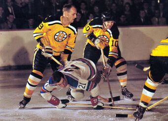
Part of the dynamic here is that, depending on how you count it, the Bruins have had around 6-10 different jersey concepts in their history... and they have already released "retro" takes on nearly all of them:

compare-bruins-winter-classic-1924-590x428.jpg


BFLAxep-bQBts1Jc1nOwQX7WqlttOZEQJ1_d-pLdKMYMZrepCchocvn1GCoJAGLxBDEgLnad5zSeMeMSpgep1cK_QkBC9w9cnrG9tv64Y0168tcNOTwku7DIrE01nNnaLchWiII


13061212411889.jpg


cut.jpg


340

BruinsWCvsSens.png


340

Big-Read-Patrice-Bergeron-feature.jpg


At some point there are declining returns on continuing to roll out minor tweaks on things you've already done. Other than just tweaking black/white/gold elements on the same templates, they're down to only a few fresh options:
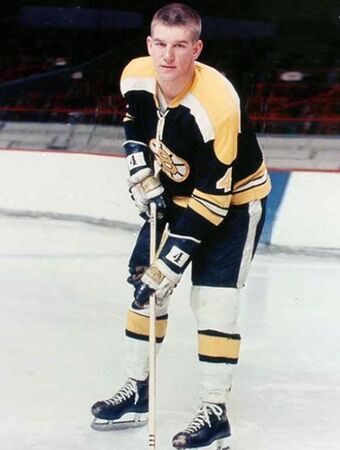
- WWII era "script"
- 1970s/80s "meth bear"
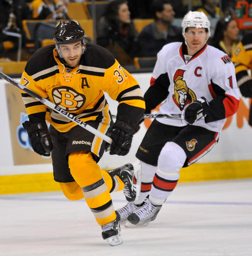
- 90s/00s "long shoulders" and "Pooh bear" (which would mean making an alternate of an alternate)


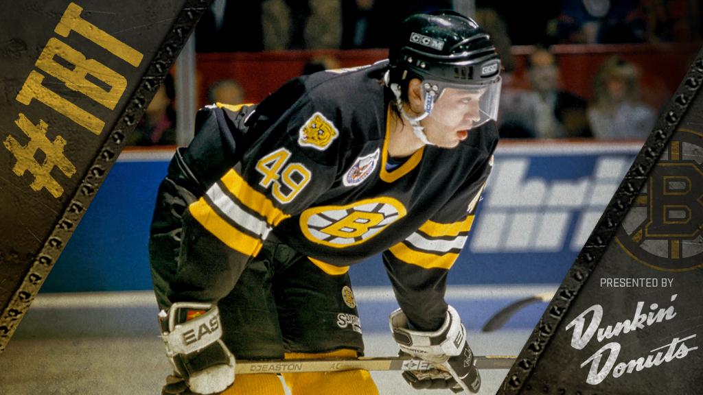
So for a relatively small promotion like this one, from a marketing/design perspective it's actually pretty clever to take the 70s/80s look and switch it up with the 1950s gold. That gives them a vintage vibe without burning one of their major remaining options for the future. They'll get A LOT more traction if they hold onto the standard black/white version of the 80s jersey and then roll it out for a Winter Classic, or as the basis for a total brand refresh a few years down the road.
 

JianYang

Registered User
Sep 29, 2017
17,924
16,416
Glad they didn't go full Pooh Bear.

I want to say this jersey was.... mid 90's? I'm having a hard time visualizing that jersey in my head.

I think that pooh bear jersey ran from about 1995 to the mid 2000s. It looks like the the main colour is sort of inspired by that one.
 

Mobiandi

Registered User
Jan 17, 2015
20,996
17,407
It's a nice jersey. Doesn't wow you but also doesn't destroy your eyes. Probably the most firmly 7/10 jersey in the league
 
Last edited:

Ad

Upcoming events

Ad

Ad