Confirmed with Link: Branding, Jerseys, Community Involvement, Arena & Water Street Tampa - Part 4

Status
Not open for further replies.

TheDaysOf 04

[ 2 6 ] [ 4 ]
Jun 23, 2007
52,912
22,729
NJ
Bolts are wearing their retro jerseys tomorrow.

A little look at practice today with the bolts wearing the old black pants


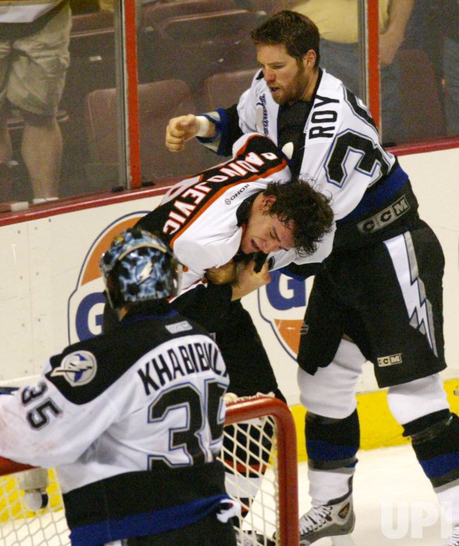
PHI2004051317.jpg
 

LightningStrikes

Champa Bay Lightning
Nov 24, 2009
26,172
9,977

I could see Coop being on board with something like that, but you can go overboard like Vegas.

Notre Dame has gold hockey helmets, but it's not distracting.

And just because you can do something doesn't mean you should. It's not like you can really monetize helmets.

history of ND's hockey helmets: Notre Dame’s Hockey Helmets Sure Look Familiar (Published 2017)

I mean Germany’s flag is black, red and gold. But there’s a reason their jerseys are black, red and (mustard) yellow and not gold. And it’s not because they’re cheap.
 
  • Like
Reactions: Felonious Python

Felonious Python

Minor League Degenerate
Aug 20, 2004
30,630
8,783
Best way to rally for the retro jerseys is to buy a reverse retro. Those look unbelievable.
I'm not sure about that. Letting the team know through social media and/or ticket reps would probably be the best way. Buying the reverse retro means that the reverse retro will survive.

It's why I don't buy shampoo. I want stores to stock the real thing.
 

LightningStrikes

Champa Bay Lightning
Nov 24, 2009
26,172
9,977
I could live with the reverse retros. They look sharp as hell. On TV black jerseys on white ice are a bit rough on the eyes IMO. Blue looks good and feels good.

Way better than our main jerseys in any case. That Leafs / Wings melange doesn’t exactly scream we have our own identity.
 

Hoek

Legendary Poster A
May 12, 2003
11,454
8,855
Tampa, FL
STM members got a survey about jerseys a year or so ago, I made sure mine was clear about getting a true black retro.
 

These Are The Days

Oh no! We suck again!!
May 17, 2014
34,329
20,078
Tampa Bay
STM members got a survey about jerseys a year or so ago, I made sure mine was clear about getting a true black retro.

You don't have to look long and hard to find day 1 Lightning fans around the area (Now that I think of it... Aren't you a day 1 fan yourself?) and not one I have talked to in all these years likes the fact we switched our color scheme to blue. The fact they gave us those crappy BOLTS and gradient jerseys that would never catch on is all the proof we need that the front office knows what we want black jerseys and the 2004 retro was an act to preserve their idea of a blue brand identity.
 

berlin

04, 20, 21, CHAMPS
Jul 14, 2012
5,746
2,266
Kokomo
The best part about the originals were their color scheme. The logo not so much. IMO we’ve never looked better. Although I would like a bit of black incorporated into our current threads.
 

Sky04

Registered User
Jan 8, 2009
29,062
18,136
Not really a fan of all black, black pants are enough. The reverse retro scheme is perfect, just needs a more modern logo.
 

DrMartinVanNostrand

Kramerica Industries
Oct 6, 2017
4,588
5,077
Tampa, FL
I'm always going to be partial to black myself because it's my favorite color. I was disappointed when it became clear this franchise was going to switch from being a black-first team to a blue-first team, and especially so with those first few years when the only black was, like, the gloves and the outline of the lightning bolt on the breezers. I was happy when a black alt was introduced, finally, but even then that alternate just ended up looking once again like us aping another team's look (that they debuted against the Kings was just the icing on that particular cake). The current black alternates are a mess and should've never been approved, honestly. Nothing about them looks appropriate for a hockey sweater.

The original logo is too ClipArty for my liking as far as going back to that, so that's not my preference. But the template from the 2004 Cup sweaters? Yes. You can tinker a little bit within that, but they have proper hem and arm striping, color balance, and I'm also partial towards shoulder yolks. Maybe you could make the white yolks silver instead, to put a little different spin on them, maybe you go with a slightly different striping pattern on the hem, but the most important thing is that the component parts are there to work with. Black/blue/silver/white is a unique color scheme as well.

And if anybody has any concern that our current look now having a Cup to its name might cement it, don't be too certain. The Ducks debuted an alternate sweater with more orange not long after they won the Cup in 2007, and it wasn't too long before those were the primaries and their Cup sweaters were retired. That's just one example that instantly comes to mind (if anybody was thinking the Penguins after 2016, it would be a bad example because their then-throwbacks were already set to be their next primary sweater the next season no matter how their postseason went that year). The only thing stopping the Lightning here would be themselves.
 

Felonious Python

Minor League Degenerate
Aug 20, 2004
30,630
8,783
Y'all wanted blue back in the day. The cowboys era sweater wasn't great though and maybe kind of drove that a bit.
 
Status
Not open for further replies.

Ad

Upcoming events

Ad

Ad