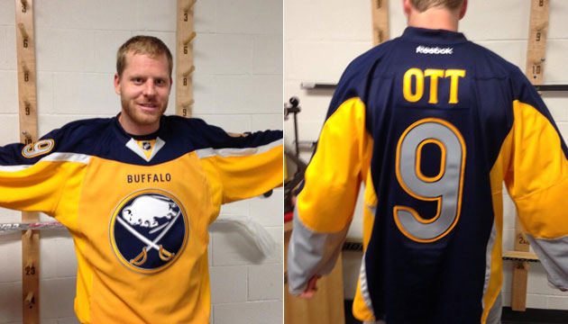
Best and worst current jersey

M88K

irreverent
May 24, 2014
9,213
7,148
The Jersey Color is great, if we had our old logo it would be the best but that damn D.
Anyway
Best: SJ (especially the Black) TB(dark)
Worst: Toronto, Montreal, Pittsburgh, Winnipeg, Detroit, Boston
 

kilowatt

the vibes are not immaculate
Jan 1, 2009
18,404
21,010
Pretty surprised to see people enjoying the Kings jerseys. I think the home plate logo leaves a lot to be desired at the very least, but the Kings' purple and gold are so iconic and historic that it's a real shame we don't have any purple home jerseys.

lak10b-doughty.jpg


These are so awesome.
 

KingBran

Three Eyed Raven
Apr 24, 2014
6,436
2,284
Then more for people who don't. Bigger point is they're not changing it any time soon.
No doubt. And they shouldn't. Teams that change their jerseys often in sports are *usually* having some form of financial trouble and are trying to stimulate the fanbase.
 
  • Like
Reactions: SealsFan

Sniper99

Registered User
Jan 12, 2011
12,446
5,322
Edmonton
1. Best jersey:

The jersey in your avatar was always one of my favorites

Best Jerseys: Leafs (yes i'm biased deal with it ;) ) Devils home red, Rangers road whites, Hawks home red (burn that white collar) Vegas jerseys (whatever that fabric is they use for the gold patch can go) Wild, Dallas home and road, Oilers away, Jets home, Predators away, Sabres away, Blues home, and finally, hated them as a kid, I dig them now, Arizona picaso coyotee 3rd jersey

Worst: Nashville Home, Oilers home, Vancouver home and away, Islanders, Flames.

Guilty: Penguins home, Caps home, Bruins 80's-early 90's, Canucks skate, Detroit home and away
 
  • Like
Reactions: Snarky Coyote

scoopscj

Registered User
Feb 13, 2009
890
726
Central Joy-See
Devils fan... if not picking my team...

Love... Redwings, Vegas, and hate to say.. Rangers Blue with the white ties looks cool.


Dont like.... Flyers orange, Ducks and Nucks
 

SealsFan

Registered User
May 3, 2009
1,716
506
Best: Detroit white, Chicago red
Worst: Nashville yellow (logo screams "minor league"), Washington (weak wordmark, awkward striping)

My contention is that most expansion teams "got it right" with their original jersey and any changes in colors, logo or design were a downgrade. Example: Kings, Blues, Capitals, Sabres, Canucks, Islanders, Calgary, Ducks, Sharks, ...
 

jetsforever

Registered User
Dec 14, 2013
27,306
23,286
Best: Detroit, Toronto, NY Rangers
Worst: Carolina, Nashville, LA, Washington
Guilty pleasure: SJ (including black alternate), Vancouver
 

jetsforever

Registered User
Dec 14, 2013
27,306
23,286
These threads always go the same way.

Best - simple, old, traditional logos; usually original 6.
Worst - any newer logos that try to be different/creative.

In general though, simple logos are better - easier to make out from a distance, not too involved, etc.
Compare something clean like NJ with something more complicated like Columbus
 

JT Kreider

FIRE GORDIE CLARK
Dec 24, 2010
16,903
15,464
NYC
LOL what? The "away" jersey is as much if not better than the "home" jersey especially considering the history of the Montreal Canadiens with the iconic white jersey.

Agreed. Canadiens white jerseys are among the sharpest and most iconic in the league.

Guilty pleasure are the Lightning's black alternates. Something about them.
 

featherhawk

Registered User
Dec 13, 2006
14,239
4,965
Pretty surprised to see people enjoying the Kings jerseys. I think the home plate logo leaves a lot to be desired at the very least, but the Kings' purple and gold are so iconic and historic that it's a real shame we don't have any purple home jerseys.

lak10b-doughty.jpg


These are so awesome.

Agreed the crown in that jersey is epic, boggles my mind that that is not still the logo regardless of what colour they changed the jersey too.

Really don't see why they would not keep the purple/gold colour, the lakers have not wavered.....
 

ArmadilloThumb

Registered User
Apr 20, 2018
511
378
For current:

Best: Habs white, Hawks White, Habs Red, Hawks Red (though ALL of these have f'd up collars on the current Adidas - need to change those. Oilers get mentioned as doing the collars correctly on Adidas.

Worst: Ducks current whatever it is - they should have stuck with the original.

Best Thowback: St Louis Blues!!! Arizona Kachina for honorable mention.

Guilty Pleasure: Preds white!! Colorado 3rds for Honorable Mention.

Best old: original Caps red and white versions (the current attempt is NOT true to the original), Kings original Purple and Yellow, Seals Dark Green and Gold,

Again the Adidas collars need to change. It's hersiey what they do to some classic designs (and then there is the rediculous fish skeleton on a bunch of Adidias - so glad I have Made in Canada Edge 2.0 versions)
 

Ad

Upcoming events

Ad

Ad