Around the League 2019-20 - part IX

Status
Not open for further replies.

JrFischer54

Registered User
Apr 4, 2017
10,259
4,007
That logo is brutal. That’s the best you could come up with when the name is kraken? I’m fine with the colors as long as it isn’t black. But very lame logo the generic letter
 

SteveCangialosi123

Registered User
Feb 17, 2012
28,078
48,274
NJ
This logo stinks
octopus_1f419.png
 
  • Like
Reactions: Patrik26

JrFischer54

Registered User
Apr 4, 2017
10,259
4,007
Is that jersey shown in the other thread legit real? I still haven’t seen it elsewhere
 

Devils731

Registered User
Jun 23, 2008
12,327
16,417
I think it all looks good. Color scheme is nice. I like the tentacle and eye in the letter of the main logo and the space needle in the secondary.
 

Bleedred

Travis Green BLOWS! Bring back Nasreddine!
Sponsor
May 1, 2011
129,957
57,194
I like the logo and everything, but it sort of reminds me of the S in the White Sox logo.
 
  • Like
Reactions: nugg and Nubmer6

glenwo2

LINDY RUFF NEEDS VIAGRA!!
Oct 18, 2008
52,050
24,329
New Jersey(No Fanz!)
Sorry but to those who complain about the Kraken name....

It's the best one out of a weak group of names that were being thrown around.

I was thinking Seattle Strikers but Kraken is fine.

And it's going to have to be 'cause this is going to be it.

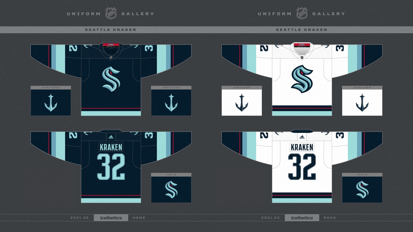
The Jerseys and the logo design need a bit more fine-tuning, though.
 
Status
Not open for further replies.

Ad

Upcoming events

Ad

Ad