
Team name and jersey ideas
- Thread starter Summer Rose
- Start date
You are using an out of date browser. It may not display this or other websites correctly.
You should upgrade or use an alternative browser.
You should upgrade or use an alternative browser.

BadPhish
Registered User
The copper one is snaZZy.
zombie kopitar
custom title
are you guy's generating these yourself? Never used AI but was trying to do something with the Utah Bobcats just cause I like it for whatever reason
i'm doing something wrong
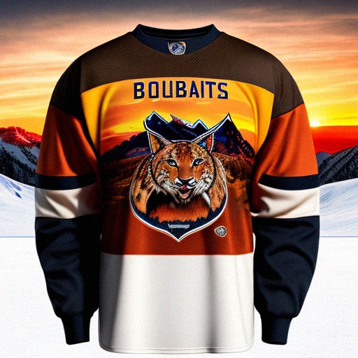
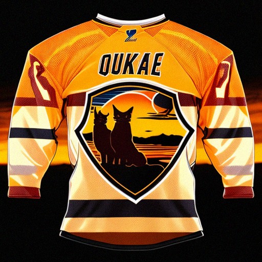
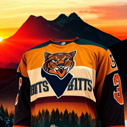
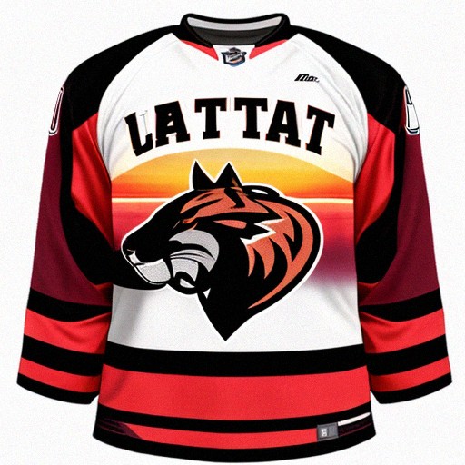
i spent way too much time doing this and these were the best lol, but at least it got the color scheme
i'm doing something wrong
i spent way too much time doing this and these were the best lol, but at least it got the color scheme
rt
The Kinder, Gentler Version
I think they’re doing Yetis. I really do.
And the agency they hired recently did the Bucks rebrand. Here’s an example:

Seems pretty straight to the point. No frills. No goody cartoon crap.
And the agency they hired recently did the Bucks rebrand. Here’s an example:
Seems pretty straight to the point. No frills. No goody cartoon crap.
Haha I have been sick the past few days and that’s how I’ve been passing the time. Feeling better now though so I think I’m taking a break and getting back to real lifei spent way too much time doing this and these were the best lol, but at least it got the color scheme
rt
The Kinder, Gentler Version
I may ask AI to do a Yetis kit in the style of the Bucks designs and get super specific in my prompts to make the logo very clean and sleek and simple.
rt
The Kinder, Gentler Version
rt
The Kinder, Gentler Version
rt
The Kinder, Gentler Version
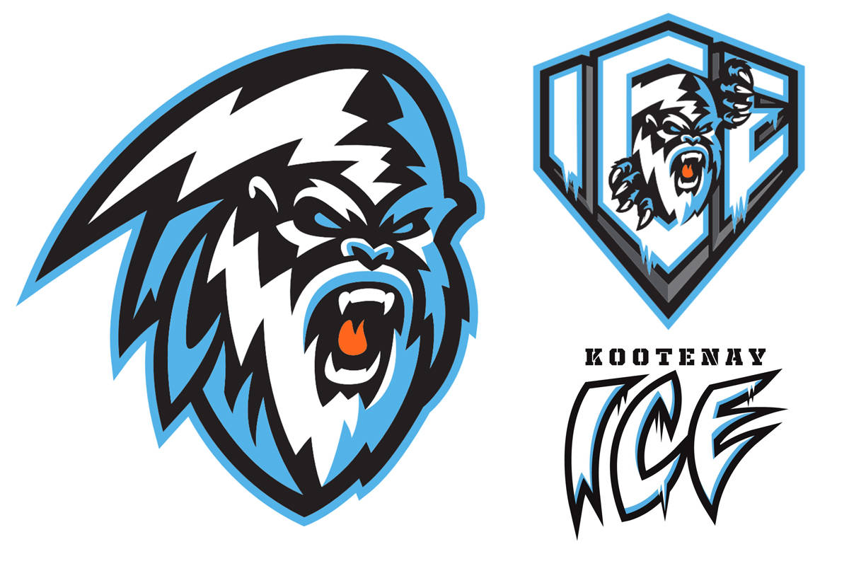
The old Kootenay/Winnipeg Ice logo is a good starting point for a cool yet modern looking but simple Yeti design.
Re the Saints and Eagles, with the expeception of the reborn Winnipeg Jets, there hasn't been a team in the four major sports that has picked an existing mascot from the other majors since the Carolina Panthers in '95.
Someone mentioned the Utah Phoenix in another thread and that is pretty fire to me. Works really well with the red, brown, slate yellows that were being shown earlier in the thread as well.
Utah Phoenix rising from the ashes of the old, ushering in the new. A franchise reborn.
That story line writes itself honestly.
Utah Phoenix rising from the ashes of the old, ushering in the new. A franchise reborn.
That story line writes itself honestly.
rt
The Kinder, Gentler Version
No offense but that’s exactly what I hope to avoid.The old Kootenay/Winnipeg Ice logo is a good starting point for a cool yet modern looking but simple Yeti design.
Anyone see a big dumb goofy monster thing here?
Seattle took a stupid, childish name and made an incredible 10/10 brand out of it.
Yeti is a stupid, childish name. Utah has a chance to do what Seattle did and make a great brand out of it.
Step one: don’t show the monster. It’s like a horror movie. It’s better if you never see it. Once you see it, your realize how silly the whole thing is.
That would be hilarious and I would love it. But I can’t see it happening.Someone mentioned the Utah Phoenix in another thread and that is pretty fire to me. Works really well with the red, brown, slate yellows that were being shown earlier in the thread as well.
Utah Phoenix rising from the ashes of the old, ushering in the new. A franchise reborn.
That story line writes itself honestly.
No offense but that’s exactly what I hope to avoid.
Anyone see a big dumb goofy monster thing here?
View attachment 855501
Seattle took a stupid, childish name and made an incredible 10/10 brand out of it.
Yeti is a stupid, childish name. Utah has a chance to do what Seattle did and make a great brand out of it.
Step one: don’t show the monster. It’s like a horror movie. It’s better if you never see it. Once you see it, your realize how silly the whole thing is.
That's a good point. Eventually they will likely move into it though.
That would be hilarious and I would love it. But I can’t see it happening.
Would be pretty sick though. Not like Arizona is using Phoenix in their name anymore.
I hate to do this but...
@Foggy1097 can you humor me and do a Salt Lake Sax kit? It can be as ridiculous and cartoony as you want or as minimalist and classy as you can possibly make it. I just need to see one.
@Foggy1097 can you humor me and do a Salt Lake Sax kit? It can be as ridiculous and cartoony as you want or as minimalist and classy as you can possibly make it. I just need to see one.
Haha I’ll see what I can do…I would be pretty happy with something like this. It’s about as simple as you can get for the yeti I think. One text and one no text.I hate to do this but...
@Foggy1097 can you humor me and do a Salt Lake Sax kit? It can be as ridiculous and cartoony as you want or as minimalist and classy as you can possibly make it. I just need to see one.
rt
The Kinder, Gentler Version
@Foggy1097 hahahahahahhahahahahahahahahahahahahahahhahahahahahahahahahhahahahahahahhahahhahahahahahahahhahahahahahahahhahahahahhahahahshshhshshshshahahahaha
Hahahahahahahahaha incredible
rt
The Kinder, Gentler Version
These colors they keep using. Steel blue, silver, and charcoal. I could see a yeti kit with those colors. Especially something where you don’t see the monster. And like how Kraken has that vague pirate/sea serpent/nautical cont, maybe we see like a boulders and ice reminiscent font.
View attachment 855526
These colors they keep using. Steel blue, silver, and charcoal. I could see a yeti kit with those colors. Especially something where you don’t see the monster. And like how Kraken has that vague pirate/sea serpent/nautical cont, maybe we see like a boulders and ice reminiscent font.
Kraken can work because it's got tentacles while the rest is hidden below the waves. With a Yeti the only thing your going to see is footprints in the snow. Which is kinda already a Avs alt logo. Perhaps you could have some sort of logo where the Yeti is hiding in it?
rt
The Kinder, Gentler Version
No way. There’s no goofy cartoon Devil in New Jersey’s logo. Looking back at the fan mock-ups of the Kraken they all suck. Because they all have big dumb squid monsters in them.Kraken can work because it's got tentacles while the rest is hidden below the waves. With a Yeti the only thing your going to see is footprints in the snow. Which is kinda already a Avs alt logo. Perhaps you could have some sort of logo where the Yeti is hiding in it?
It should be evocative of snowy mountain monster. Just like Seattle is evocative of a giant sea monster. Shouldn’t actually show it. That’s very minor league. Like the Winnipeg ICE logo. Very childish looking.