- Oct 3, 2013
- 36,819
- 10,603
Yeah. Misread something somewhere methinks.Wait on the 18/19 jersey's?
Yeah. Misread something somewhere methinks.Wait on the 18/19 jersey's?
Yeah. Misread something somewhere methinks.
 but yes I 100% agree with you. I think it’s pretty awful.
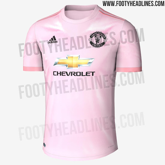
It's said that the color of the Manchester United 2018-2019 away shirt is inspired by the classic "Football Pink" section of the local Manchester Evening News, which as its name suggests,was printed on light pink paper.
Here's their away kit, according to FH:
EXCLUSIVE: Pink Manchester United 18-19 Away Kit Leaked - Footy Headlines
Arsenal hasn't had a good kit since the purple reign one which is one of best kits ever made.I like Everton's kit tbh. Arsenal really need to switch back to Nike/Adidas tho.

Arsenal hasn't had a good kit since the purple reign one which is one of best kits ever made.
The home kits by Puma have been notoriously awful...I mean how hard is it to design a home kit using the colours of red and white in a classy original fashion?? Seriously, no Gooner wants nor expects a dramatically different home kit...

The best Arsenal kit by far was the maroon/burgundy one that they had in the last year of Highbury.They had 3 great kits that year, and I have the home one. But seriously, just give us this every year:
The best Arsenal kit by far was the maroon/burgundy one that they had in the last year of Highbury.
That is one of the best kits I've ever seen.
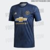
That Man U jersey is terrible...
Lol which one? 2/3 are just awful.
I really don't like the pink one. Juve barely pulled that look off, Man U is striking out hard
I love the blue one, I think that one looks really good. But the red and pink ones are just god awful.
I agree, the deep blue look is the only good one. 1/3 aint good, got to step it up United :p
It’s the only jersey where the Chevy logo doesn’t completely ruin the jersey. And it only took like 4 years lol. But yes I agree, 1/3 is baaad.
Unfortunate that United has that Chevy sign. Worst sponser in soccer imo
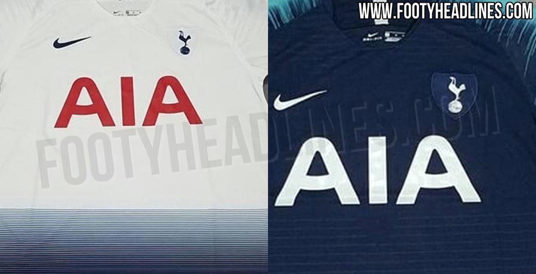
Another Horizontal gradient? Horrible. hideousRumored new Spurs kits
Another Horizontal gradient? Horrible. hideous