Logo/Colors/rebranding

Bub

I like griping
Jul 5, 2006
2,114
5,923
Maine
And yes, nostalgia is a big reason that a lot of people don't care for the Canes logo, not to mention that the Whalers logo legitimately was a classic. But you can't look at the Canes logo and then look at any of the Canucks logos and definitively tell me that ours is worse. It's not a total home run but it's certainly better then the current Panthers, current Sens, and literally every Canucks or Ducks logo that have been used.

I really like the Canucks orca logo. I also kinda like the simple stick logo, in a 70s-retro sort of way.
 

Svechhammer

THIS is hockey?
Jun 8, 2017
23,729
87,217
Those colors look like moldy bread
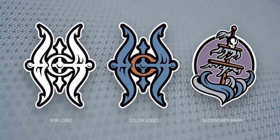
I think if you used other colors they could be alright. I do wonder if there is a good marketing possibility there for us to adopt more of a pirate theme within the Hurricanes brand in the future... Red and black could play well with the various pirates (Blackbeard, Barbarossa, etc)

Don't get me wrong, I don't like any of those concepts, and you can tell they were designed at the same time the Fisherman Isles logo came out, but I wonder where it could have gone if they continued down that path rather than pivoted like they did.
 

geehaad

HFBoards Sponsor
Sponsor
Aug 24, 2006
7,512
18,876
Same thing would likely happen with the logo. It’s underrated from a design perspective because people associate it with a bad team. It’s actually a really solid crest for a hockey jersey — geometric, symmetrical, balanced, looks good from a distance and has some aesthetic detail when viewed close up. It’s a literal representation of a hurricane but also has an abstract quality. I wouldn’t expect to see a better logo as a replacement — I’d expect to see something generic and knockoff-ish, which would be panned universally while the former logo elevates to nostalgia level 10.
Thank you
Thank you
Thank you
Thank you

The abstract quality that I think many don't recognize: it looks like the eye of a monster.

superthumb.gif
 

AeroFishOne

The Curriest of the Curry’s
Feb 5, 2010
1,323
4,696
I mean, look at the logos used by the actual Pirates. Other than the "P" lettermark, they've been absolutely awful over the

Relative to the age of the franchise (and abundant opportunity to get it right, at least once) that might be the worst logo history in all of pro sports.

I’d stick to a Pirate ship and if you wanted to go pirate, go skeletal pirate. Probably my favorite thing disney related is the skeletal helmsman in the hurricane on the Pirates of the Caribbean ride. Cool to see other people are favorable to the pirate idea as a secondary option as well.
 

NotOpie

"Puck don't lie"
Jun 12, 2006
9,258
17,778
North Carolina
If someone can introduce me to a Logo that can score 30 goals, or a Logo that can maintain a .920 save percentage, then I'm interested. Young Tucker Logo of the Medicine Hat bantams, say.

Otherwise, there's not much about a Logo conversation that interests me, I'm afraid.

this thread can still be salvaged if we make it about legos, lego colors, and branded legos

i always liked the pirate ones back in the day

Oh shit, legos...logos....I thought this board with made up of IT and engineer types and thought the whole conversation was about logarithms....so confuse
 

cptjeff

Reprehensible User
Sep 18, 2008
20,593
34,765
Washington, DC.
Nor I. It's fine for Cam's mask but beyond that it's just meh. I'm fine with the current logo set as it stands. No need to reinvent something that already works.

Yeah, that original pirate mask was easily Cam's best mask, pity it cracked, but I think the pirate motifs should probably stay on things like goalie masks and homegrown novelty tee shirts.
 

Hulkacaniac

You MUST
Jun 4, 2015
1,712
9,331
NC
For 20 years I’ve been a Canes fan and for 20 years I’ve despised our logos. I’m not alone- the Canes logo is universally and consistently rated as one of, if not THE worst in sports. Both the toilet bowl logo and the “tropical depression” alternate need to go. Love the warning flags tho and really like how the tone on tone look of the new home jerseys.

As for the colors, I realize they agreed on the red bc of NCSU but that’s an easy fix now. If state’s playing use their colors on the scoreboard, ribbons and lighting. Then use a neutral color for the seats, etc.. So many NHL teams have the red/black scheme. Why not green and blue? It’s looks great on the ice and gives a nod to the club’s history.

I say this last (bc it’s a pipe dream) but it would be cool to drop Carolina for NC. Not North Carolina but NC. It’s different, original and more appropriate. When naming the panthers Richardson actually chose Carolina for a reason. Charlotte’s close to SC and Richardson grew up in Spartanburg. He intentionally shaped the panther logo like the 2 states.

Anyway, I’m interested to see what you guys think. Should TD make any of the above changes? Will he? I haven’t heard him say anything about it. Haven’t heard anyone ask him either.
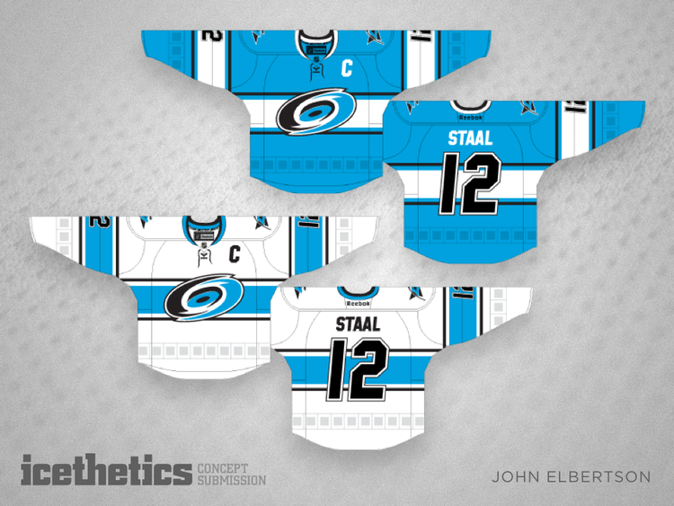
Hmm...color change you say? How about something like this:
1437364633339

No take backs! :p:

I think, though, with the most recent change to the uniforms I am content with everything. The logo sits real well on a jersey or a t shirt and it's unique and identifiable. I can't really ask for more. Really my concern is if you go through a whole rebrand process starting over from scratch the designers and marketing experts are less likely to give you something like this:
1497985968724
and are more likely to give you an abomination like this:
eaaf92e6da279d37.jpg
I'm not willing to play the odds when I'm fine with what we've got.
 

Ad

Upcoming events

Ad

Ad