Laces being added onto jerseys

LeafsNation75

Registered User
Jan 15, 2010
37,975
12,506
Toronto, Ontario
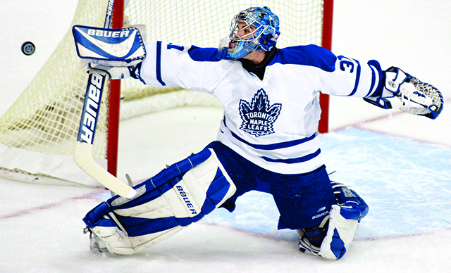
I remember when the 1998-1999 season started the Maple Leafs introduced this as an alternate jersey.


It was brought back once again starting for the 2000-2001 season and one thing it had was laces around the neck. Since that time the Maple Leafs like a lot of teams have added them to their current home and away jerseys.

The only teams who still don't have any laces on their current jerseys is Detroit, Tampa Bay, Chicago, St Louis, Colorado, Nashville, Ottawa, Washington, Pittsburgh, Los Angeles, Las Vegas, Vancouver, Edmonton, New Jersey and Columbus.

So are you fan of laces on the jerseys or do you not like seeing them?
 
  • Like
Reactions: SealsFan

Killion

Registered User
Feb 19, 2010
36,763
3,215
I certainly am (a fan of the lace-ups).... Particularly so with the 06 jerseys excluding Detroit who traditionally never did go with a lace-up. With everything thats followed post 66/67, there are some teams who's jerseys wouldnt really work with the lace-up, others that would, have & do. What I dont like about the modern lace-up's is the flange, piece of fabric behind the eyelets & lace, sort of "cheating" as thats not a real lace-up to me.... As a kid, I received a Leafs jersey one year for Christmas & it was from the 50's, not a lace-up, crew neck, just like the ones Ted Kennedy & the boys wore and I can tell you it was hot & itchy, even outside in moderately cold weather. Didnt like that (who would?) feeling of the crew neck with jerseys sans the lace-up. Too warm. Always wondered how the Red Wings players felt about it..... overheating..... ha?... Some of the crazy things we all think about. :laugh:
 

DowntownBooster

Registered User
Jun 21, 2011
3,202
2,414
Winnipeg
Not a fan of laces on jerseys........can't see the need for them when a simple v-neck will do. Also don't like the way the NHL logo is incorporated into the collar as it looks too intrusive. If it was a little more subtle in appearance I wouldn't mind it.

:jets
 

LeafsNation75

Registered User
Jan 15, 2010
37,975
12,506
Toronto, Ontario
Not a fan of laces on jerseys........can't see the need for them when a simple v-neck will do. Also don't like the way the NHL logo is incorporated into the collar as it looks too intrusive. If it was a little more subtle in appearance I wouldn't mind it.

:jets
I actually like the NHL logo being where it is and I guess they were going for the NFL style of what they do. Plus ever since the switch to Adidas I think the logo looks even better compared to the Reebok jerseys.
 

Killion

Registered User
Feb 19, 2010
36,763
3,215
Is there even a single player in the league that actually ties the laces?

... :laugh: even back in the day I think a lot of them left loose or just knotted.
I'd imagine from a Trainers perspective there a bit of a hassle, extra work.
 

Killion

Registered User
Feb 19, 2010
36,763
3,215
:eek: Woo. I hope the Fashion Police Busted Cujo for that Crime. Looks dreadful. Especially with the navy blue Dickey... mock turtleneck or whatever the Sam Hill Mickey Dolenz look he's goin for with that thing.... and ya ya I know, its protection... Clint Malarchuk, Kim Crouch n' all... Look Maing... they do come in white... or... is it? On 2nd look, mebbe not, could be just an undergarment of some kind, t-shirt which makes it even worse.... and put the lace back in plz.... and in fact on 3rd look?.... I dont much care for Josephs entire rig, kit, setup, junk. Bauer "Wave" pads, Blocker & Catcher. What is that supposed to do; psych out the shooter? Looks like it was designed by the Culligan Man. Lame.
 
Last edited:

yukoner88

Registered User
Dec 16, 2009
19,870
24,039
Dawson City, YT
dang man a lil rough there, that was my 2nd fav get up of his that he had. Most favorite was his (i think tps) navy blue pads with the bronze 5-hole with Edmonton
 
  • Like
Reactions: MarkStone

SealsFan

Registered User
May 3, 2009
1,716
506
Always liked the laces in the old days but not too keen on the new ones with the plastic piece or "flange" whatever, looks like it might feel constricting. My first jersey was a WOOL black Bruins, sans crest (had to buy that separately and sew it on) from the local sporting goods store and it had the lace holes but I don't think it came with the lace. Probably appropriated a black shoelace from one of the many boxes of knick-knacks in my dad's garage. Never actually tied the laces but man did I feel invincible wearing that thing, lol...
 
  • Like
Reactions: Killion

Killion

Registered User
Feb 19, 2010
36,763
3,215
dang man a lil rough there, that was my 2nd fav get up of his that he had. Most favorite was his (i think tps) navy blue pads with the bronze 5-hole with Edmonton

... pads, blocker, catcher"? should all be stock, standardized...
solid tan.. masks face flush.... wood stick, natural color, no curve.

... skaters? soft leather shoulder & elbow pads that give... tan colored gloves,
wood sticks only.... no names on the backs of their jerseys... Draft Age = 20.

... buildings? no rink board advertising, no stairwell or behind bench or penalty
box signage... no "game presentations".... no goal horns or LED shows, one Ref.

... all jerseys to be tie down, no flange/fabric behind the lace joining the v opening. thats fake. :squint:
 
Last edited:

blood gin

Registered User
Jan 17, 2017
4,174
2,203
Rangers were one of the first to bring them back but to be honest they looked better with their old collar design rather then the drab solid red collar with laces

5020-112Bk.jpg


973316f22a1f2334.jpg


Rangers also looked better with more space between the stripes
 

Chief Nine

Registered User
May 31, 2015
12,006
15,755
Love the laces, to me it's one of the best looks on most team's jerseys. Some work better without them like the Blackhawks. That said, the current Sabres home set with the laces looks like a fish skeleton

Sabres%20Jersey_1498010783501_61533902_ver1.0_640_480.jpg
 

Theokritos

Global Moderator
Apr 6, 2010
12,541
4,937
The only teams who still don't have any laces on their current jerseys is Detroit, Tampa Bay, Chicago, St Louis, Colorado, Nashville, Ottawa, Washington, Pittsburgh, Los Angeles, Las Vegas, Vancouver, Edmonton, New Jersey and Columbus.

"Only" is a strange way to put it. You've justed listed 15 out of 31 teams in the league.
 

Killion

Registered User
Feb 19, 2010
36,763
3,215
Love the laces, to me it's one of the best looks on most team's jerseys. Some work better without them like the Blackhawks. That said, the current Sabres home set with the laces looks like a fish skeleton

Sabres%20Jersey_1498010783501_61533902_ver1.0_640_480.jpg

..... :laugh: your absolutely right it does... straight out of the Flintstones, like Barney Rubbles' "tie" or something. Way to wreck one of the nicest jerseys EVER. If they just got rid of that stupid "flange" in white or whatever the Hell its called, kept the white laces with just solid matching blue or even white eyelets with an open 'v' it'd look fabulous. Talk about "overstating" in fashion, overstating the fact that its a new era & design tie down like that is not complimentary, at least not to my eye. Unfortunately you go around the NHL with these Adidas jerseys & you see similar. Over-done.
 

Chief Nine

Registered User
May 31, 2015
12,006
15,755
..... :laugh: your absolutely right it does... straight out of the Flintstones, like Barney Rubbles' "tie" or something. Way to wreck one of the nicest jerseys EVER. If they just got rid of that stupid "flange" in white or whatever the Hell its called, kept the white laces with just solid matching blue or even white eyelets with an open 'v' it'd look fabulous. Talk about "overstating" in fashion, overstating the fact that its a new era & design tie down like that is not complimentary, at least not to my eye. Unfortunately you go around the NHL with these Adidas jerseys & you see similar. Over-done.

Barney Rubble! :laugh::laugh: That's it!!

hqdefault.jpg


You're 100% right @Killion . The Sabres home kits are some of the best looking in the NHL but you just can't unsee that fish skeleton once it gets in your head :laugh:

I hate the white collar they "stuck"on the Blackhawks home jerseys too. Leave perfect alone.
 

LeafsNation75

Registered User
Jan 15, 2010
37,975
12,506
Toronto, Ontario
I hate the white collar they "stuck"on the Blackhawks home jerseys too. Leave perfect alone.
Since the Leafs completely changed their logo prior to the 2016-2017 season I didn't expect any changes to their jerseys with Adidas. However they added more blue around part of the neck where the NHL logo and laces are, which makes it look better than their Reebok version of the same jersey. I even purchased the Leafs Adidas jersey which I didn't think I would, however I got it for 35% off during a Boxing Day sale and thought why not. Anyway here are pictures of both the Reebok version and Adidas version to see those minor differences.


Chief Nine

Registered User
May 31, 2015
12,006
15,755
Since the Leafs completely changed their logo prior to the 2016-2017 season I didn't expect any changes to their jerseys with Adidas. However they added more blue around part of the neck where the NHL logo and laces are, which makes it look better than their Reebok version of the same jersey. I even purchased the Leafs Adidas jersey which I didn't think I would, however I got it for 35% off during a Boxing Day sale and thought why not. Anyway here are pictures of both the Reebok version and Adidas version to see those minor differences.


I agree with you, the more I look at the Reebok one with the white collar, the more I think it takes away from the jersey. It's OK, but I think it would be much cooler all blue there. If Adidas just left the white collar out altogether it would be great. At least they didn't give you guys a dead fish like they did to Buffalo :laugh:
 
  • Like
Reactions: LeafsNation75

LeafsNation75

Registered User
Jan 15, 2010
37,975
12,506
Toronto, Ontario
I agree with you, the more I look at the Reebok one with the white collar, the more I think it takes away from the jersey. It's OK, but I think it would be much cooler all blue there. If Adidas just left the white collar out altogether it would be great. At least they didn't give you guys a dead fish like they did to Buffalo :laugh:
I also thought it would be even better if Adidas made it a 100% blue collar, which is what Reebok did with the Maple Leafs Centennial Classic jerseys.


  • Like
Reactions: Chief Nine

Killion

Registered User
Feb 19, 2010
36,763
3,215
Since the Leafs completely changed their logo prior to the 2016-2017 season I didn't expect any changes to their jerseys with Adidas. However they added more blue around part of the neck where the NHL logo and laces are, which makes it look better than their Reebok version of the same jersey. I even purchased the Leafs Adidas jersey which I didn't think I would, however I got it for 35% off during a Boxing Day sale and thought why not. Anyway here are pictures of both the Reebok version and Adidas version to see those minor differences.


I wish (as a long time Leaf fan) they'd have done a better job of it than this..... The striping on the bottom should be the traditional narrower double stripe, the collar in white & the traditional tie-down with white laces as opposed to that semi half assed abomination of the flange & NHL logo..... and just to be sure they really tanked it, bottomed out with the change to the socks, going with a single rather than the multi grouping of stripes which the Leafs are known & noted for..... Seriously, who does this? Why would you mess with a classic traditional look like that?
 
  • Like
Reactions: LeafsNation75

LeafsNation75

Registered User
Jan 15, 2010
37,975
12,506
Toronto, Ontario
I wish (as a long time Leaf fan) they'd have done a better job of it than this..... The striping on the bottom should be the traditional narrower double stripe, the collar in white & the traditional tie-down with white laces as opposed to that semi half assed abomination of the flange & NHL logo..... and just to be sure they really tanked it, bottomed out with the change to the socks, going with a single rather than the multi grouping of stripes which the Leafs are known & noted for..... Seriously, who does this? Why would you mess with a classic traditional look like that?
You do know that picture of their jersey made by Reebok was of their Premier jersey which was the replicas at the time. Here is what the Reebok Authentic version looked like.

MATTHEWS-TORONTO-MAPLE-LEAFS-HOME-100th-ANNIVERSARY-REEBOK.jpg
 
  • Like
Reactions: Killion

Killion

Registered User
Feb 19, 2010
36,763
3,215
You do know that picture of their jersey made by Reebok was of their Premier jersey which was the replicas at the time. Here is what the Reebok Authentic version looked like.

MATTHEWS-TORONTO-MAPLE-LEAFS-HOME-100th-ANNIVERSARY-REEBOK.jpg

Which do you prefer, favorite All Time?
 

Ad

Upcoming events

Ad

Ad