
Ziggy Stardust
Master Debater
The white looks so... plain. Not that they will make the switch, but it's a shame they wouldn't be able to incorporate both the gold and forum blue sets as their away/home uniforms.
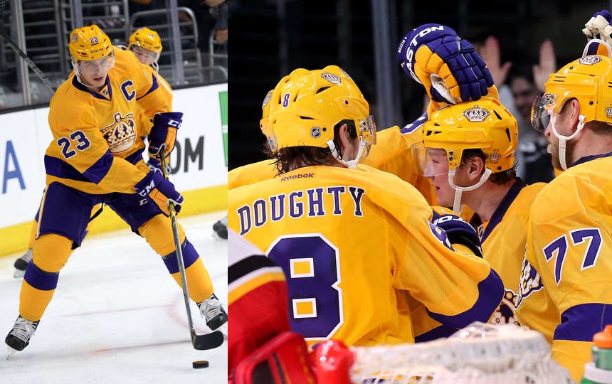
I remember this. Those whites look pretty good to me! Gold would be better, but the gold uniforms could be a third uniform for use at home.Funny, this same issue about having white instead of gold was brought up years ago and at the time I used that same Doughty photo to show what a white version might look like:

I completely understand preferring color over the silver/black/white combination and the purple/gold jerseys really pop.
The thing with the 90s silver/black sweaters is that there was a significant amount of silver in them with the crest, numbers, stripes etc. The current ones don't have enough silver in them, IMO.
Prefer the current road jerseys over the home jerseys.
Alernative 3rd jersey between 99 and 2002.View attachment 105185 Fan since 72-73 season when I was a kid. I love the revamp of the original forum blue jersey. But I loved this one when it was out. It seems no one did or they don’t want to recall that era?
Sorry for the double post.
View attachment 105185 Fan since 72-73 season when I was a kid. I love the revamp of the original forum blue jersey. But I loved this one when it was out. It seems no one did or they don’t want to recall that era?
Sorry for the double post.
Jumping into this 5 year old thread to say that the NHL has started allowing teams to wear their dark helmets with their white uniforms, so the look on the left would actually be possible in today’s nhl.Funny, this same issue about having white instead of gold was brought up years ago and at the time I used that same Doughty photo to show what a white version might look like:
Current favorite, especially the white. Looks amazing.Funny, this same issue about having white instead of gold was brought up years ago and at the time I used that same Doughty photo to show what a white version might look like:
Love and own this one. The only jersey I've bought in my adult life (had a chevy logo Sandstrom jersey when I was a teen).View attachment 105185 Fan since 72-73 season when I was a kid. I love the revamp of the original forum blue jersey. But I loved this one when it was out. It seems no one did or they don’t want to recall that era?
Sorry for the double post.
These are absolutely incredible. My goodness. Should be their everyday jersey just perfect. But nah we have to look at that stupid home plate for another decade.I love this look. Bring it back!

everyone leaguewide loved them too, that's the worst partThese are absolutely incredible. My goodness. Should be their everyday jersey just perfect. But nah we have to look at that stupid home plate for another decade.
These were sick as well. But wasn't this a third jersey. Wish they went to these permanently back then.View attachment 105185 Fan since 72-73 season when I was a kid. I love the revamp of the original forum blue jersey. But I loved this one when it was out. It seems no one did or they don’t want to recall that era?
Sorry for the double post.
