3rd Jersey Survey

VoluntaryDom

Formerly DominicBoltsFan / Ⓐ / ✞
Oct 31, 2016
23,285
5,532
Tampa FL
i like the blue ones a lot a ton actually not sure on the black ones a compromise we dont want the word bolts? make the three lines on sleeve lightning lines!! do not do the 3 lines on stomach dont like that at all:)

Think those changes would have my fav jersey. I do like the blue one line on stomach etc.. the blue are sharp to me


i agree on logo love it on black

those blue jerseys suck lol

two shades of blue

it clashes

ugly
 

JedYzerman

Registered User
Jan 8, 2011
339
16
Cocoa Beach, FL
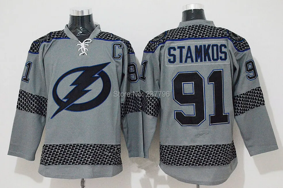
Yeah I voted no to the BOLTS thing too. I've always hated those thirds. I also added that I would love to see the thirds do something different than we did before. Maybe something like grey with blue.

Or hell maybe even something like this

New-Style-2015-Tampa-Bay-Lightning-Jersey-91-Steven-Stamkos-Jersey-Cheap-Blue-White-Purple-Grey.jpg


or this

$_35.JPG
 

Hoek

Legendary Poster A
May 12, 2003
11,454
8,856
Tampa, FL
I like that one a good deal as it works in all our colors and victory stripes.

Still think a 2004 throwback with just the logos updated would be perfect. Definitely voted against BOLTS. Sorry Vinik.
 

AlphaCatalyst

Elite Fan
Jun 27, 2007
14,921
7,126
Calgary
Decided to revive this thread due to the post I had made in the around NHL thread.


I liked the concept Master P posted but did not like the grey so made a couple variants.

Solid black stripes and just changing the grey to a "primary" colour.
Also Got rid of the "Tampa Bay" wordmark

38345102604_7ab4edb427_o.jpg
 

Ad

Upcoming events

Ad

Ad