3rd jersey speculation

tarheelhockey

Offside Review Specialist
Feb 12, 2010
85,201
138,567
Bojangles Parking Lot
The solution is to use elements of the flag, not the entirety of it. The red and white stripes work well with the color scheme of the jersey, but the rest looks so badly out of place that's it's hard to believe that they're going to force it in there.

Yep. Never really thought about that connection before, but red-over-white stripes could be a nice nod to the flag without messing up the color scheme.
 

RodTheBawd

Registered User
Oct 16, 2013
5,529
8,604
There are pretty specific rules about how flags are supposed to be displayed... granted, they’re not iron clad laws, but it’s the sort of thing that people will nitpick and make a stink about. Particularly for something as visible as this. I’d think two-tone is off the table.

Also it would be hilarious if the included SC. A good portion of the fanbase would be triggered.

Seems like 90% of those folks are here. :)

What about something like this?

View media item 2431

Somehow, some way, someone would find a way to take offense and call it racist.
 

AD Skinner

Registered User
Mar 18, 2009
12,902
39,026
bubble bath
More good stuff here:
Hurricanes tease new third jersey for 2018-19

He predicts the "canes" wordmark as a helmet decal, which probably makes more sense that the pants idea i had. Also mentions the state flag in grayscale and double flag on the chest, no triangle. I'm just not able to envision a two-flag logo that doesn't look weirdly asymmetrical.
 

Svechhammer

THIS is hockey?
Jun 8, 2017
23,745
87,382
About that wordmark... It does make sense if that's the case (and lord knows we desperately need to refresh the current wordmark)... But I'm not sure that's it. Yes, it kind of lines up, but...
0613-car18a-helmet.png

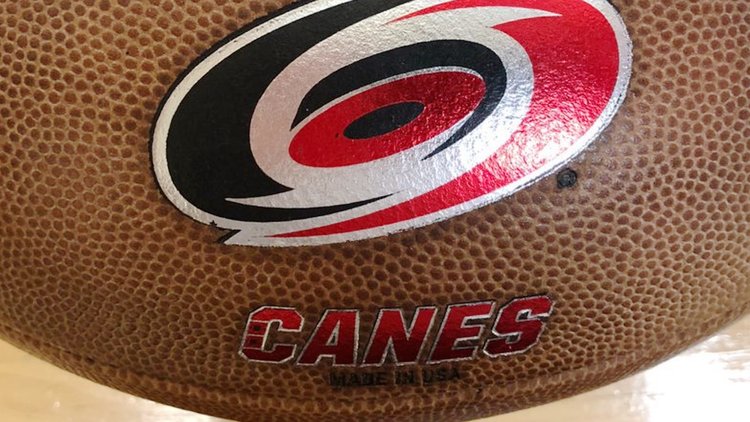
I don't know if that works. If that's the C on Canes, the end of the C, at least on that image, hangs way too low to be the wordmark that was on the football.

0613-car18a-football.jpg
 

sheriff bart

Where are the white women at
Nov 11, 2010
2,755
14,075
Rock Ridge
I... don't hate it

Edit: can't say I love it either

I picked it up for one of my daughters on ebay about 10 years ago. I think I was the only bidder. Got it for about a dollar and a few bucks shipping. About $5. It seems to be a youth or women's league jersey. It is #23 and the name is Obu. She still wears it when she goes to any hockey game and gets lots of looks and questions about it.
 

tarheelhockey

Offside Review Specialist
Feb 12, 2010
85,201
138,567
Bojangles Parking Lot
More good stuff here:
Hurricanes tease new third jersey for 2018-19

He predicts the "canes" wordmark as a helmet decal, which probably makes more sense that the pants idea i had. Also mentions the state flag in grayscale and double flag on the chest, no triangle. I'm just not able to envision a two-flag logo that doesn't look weirdly asymmetrical.

upload_2018-6-21_11-54-2.png


Sweet Jesus I hope these sources are wrong.

And if this is real, it’s time to fire the goddamn in-house design team.
 

MinJaBen

Canes Sharks Boy
Sponsor
Dec 14, 2015
20,847
80,392
Durm
View attachment 126091

Sweet Jesus I hope these sources are wrong.

And if this is real, it’s time to fire the goddamn in-house design team.
I like that double flag option. I think it would look good on the triangle as well, which would give the logo some needed width. The rest of that mock-up can go in the toilet, though.
 

DaveG

Noted Jerk
Apr 7, 2003
51,175
48,451
Winston-Salem NC
That's actually not bad, though the striping needs a LOT of work.

I like that double flag option. I think it would look good on the triangle as well, which would give the logo some needed width. The rest of that mock-up can go in the toilet, though.

Actually I was thinking the double flag would look better over an overlay of the state outline.
 

tarheelhockey

Offside Review Specialist
Feb 12, 2010
85,201
138,567
Bojangles Parking Lot
I like that double flag option. I think it would look good on the triangle as well, which would give the logo some needed width. The rest of that mock-up can go in the toilet, though.

If the flag(s) are anything like that mock-up, they desperately need a background shape of some kind. From a distance they won’t look like anything at all.

And I don’t know what the hell is going on between the shoulders. The grey yoke, patches, red piping, and collar design are just design elements being thrown at the wall. It has a highly “by committee” feel to it.

Not even gonna be bothered with the striping. It’s too ugly to be accurate. At the very least, a professional designer would narrow them down to look sleek instead of fat and clunky (the Kaberle effect).

Hopefully the real thing looks a lot better.
 

Ad

Upcoming events

Ad

Ad